Friday 19 June 2015

Why I Hold Bonds in My Portfolio

I don’t think it’s too controversial to suggest, that at its simplest, a modern portfolio will contain bonds (whether government and/or corporate, domestic and/or international, index linked and/or otherwise) and equities (whether domestic, international developed and/or emerging).  I make this statement as bonds and equities are two asset classes that historically have exhibited different properties that when combined can work together to give some interesting characteristics.  Tim Hale describes the differences well – “Equities have an economic rationale for and history of delivering mid-digit real returns (after inflation) and are considered the engines of portfolio returns, but with considerable and sometimes extremes swings in returns...  High quality domestic bonds on the other hand, tend to have far smoother return patterns at a cost of lower returns, which come in the low single digits, after inflation.”

I probably make it more complicated than it needs to be but at its heart my portfolio is not much more than a 32% bonds/68% equities portfolio which at its conclusion will likely settle at a 40% bonds/60% equities portfolio.  In comparison I’ve recently starting noticing more and more personal finance bloggers who are holding far lower or even no bond allocations in their portfolios.  This has had me thinking:
  1. has the significance of bonds in a portfolio disappeared;
  2. is it correlated to us now having been in a bull market since 2009;
  3. is it because my high savings rate encourages and allows me to live the Warren Buffet quote “Rule No. 1: Never lose money.  Rule No. 2: Never forget rule No. 1” where others might be chasing higher yields; or
  4. is it just simply that I’m now nearing the end of my rapid wealth generating journey and others are a little earlier on in theirs.

To make sure it’s not number 1 let’s spend some time going back to fundamentals to understand if bonds combined with equities are still doing their thing.  I’ve been able to source 10 full calendar years (not quite for the bonds as I’ve only been able to go back to 29 March 2004 but close enough) of total return bond and equity performance covering the years 2004 to 2014.  The bonds are the Markit iBoxx GBP Liquid Corporates Large Cap Index and the equities are the FTSE 100.  Armed with this information I can calculate the annual return possible for everything from 100% bonds, through various mixed bond/equity allocations to 100% equities for each year.  I can then calculate the volatility (I’ve used standard deviation to represent volatility) for each allocation for the 10year period.  The 100% Bonds portfolio has volatility of 7.2%, the 40% Bonds/60% Equities has 10.7% while the 100% Equities has 14.8%.  This is all shown in my first table below.

Portfolio Annual Return if Bonds/Equities Allocation Rebalanced at Start of each Year
Click to enlarge, Portfolio Annual Return if Bonds/Equities Allocation Rebalanced at Start of each Year

Saturday 13 June 2015

Adding Legal & General to my High Dividend Yield Portfolio (HYP)

On the 29 May 2015 I added Legal & General (LGEN) to my High Yield Portfolio (HYP) at a price of £2.6766 a share.  Since purchase they've fallen a little in Price closing at £2.639 on Friday.  LGEN represents my 13th formal HYP purchase and brings my total HYP portfolio to 15 shares if I include the government gift that was Royal Mail Group (RMG) and the demerger of South32 from BHP Billiton (BLT).

Having unitised my HYP I can accurately tell you that since inception in November 2011 my HYP has seen capital gains of 34.2% compared to the FTSE 100 at 27.7%.  Year to date capital gains performance switches with the HYP up only 0.6% compared with the FTSE 100 at 3.3%.  Dividend yields however, which is why I have the HYP in the first place, are 5.1% (trailing yields) for the HYP vs only 3.6% for the FTSE 100.

So why did I buy Legal & General?  Within my HYP I’m looking to buy solid companies that currently have high yields but which I hope to be able to hold for the very long term, ideally the rest of my life.  Some of the key criteria for me were:
  • The Legal & General business model is easy to understand.  They are a large insurance and investment management group with their fingers in defined benefit pensions, annuities, fund management, life insurance and fund wrapper (cofunds for example) pies.
  • I prefer large and non-cyclical industries.  Its company number 35 in the FTSE 100 with a market capitalisation of £15.8 billion and generates £1.3 billion in revenues.  It is however not a non-cyclical company.  To demonstrate in 2007 they had an adjusted earnings per share of £0.1188 which by 2008 had turned into -£0.1788.  This then also forced a dividend cut in 2008 and a further cut in 2009 which didn’t recover to 2007 levels until 2011.  So as a retiree living off LGEN dividends your ‘salary’ would have fallen by 1/3 which is not insignificant.
  • To minimise risk I'm looking for my HYP shares to be spread over a number of sectors.  LGEN adds a new sector for me – Life Insurance.
  • I’m looking for shares with dividend yields somewhere between the current FTSE 100 yield of 3.6% and 1.5 times the FTSE 100 yield or 5.4%.  On a trailing yield of 4.3% LGEN is right in the sweet spot.  Forecast dividend yield is near the top end at 5.0%.
  • The company should have an unbroken history of continually increasing dividends plus dividends that increase at a rate equal to or greater than inflation.  As already mentioned they’ve had their transgression but in the 5 years to 2014 LGEN have raised their dividends from £0.0384 per share to £0.1125 or 193% which is a country mile above inflation over the same 5 years at 18%.  Taking away the flattery that the transgression provides and dividends are also up 88% since 2007.  This nicely demonstrates why it might be prudent to carry a couple of years of cash buffer in retirement as the last thing you want to be doing is selling capital to eat when prices are severely depressed.
  • A dividend cover of greater than 1.5 for all HYP type shares except utilities where I think that greater than 1.25 is ok.  Here LGEN is right on the limit at 1.5.
  • ‘Creative accounting’ can make earnings and hence dividend cover look good.  I therefore also set a greater than or equal to 2 criteria on Operating Cash Flows compared to Dividends.  At 8.3 this is very high but for LGEN this metric moves around a lot.  In 2013 it was 2.4.
  • Valuations don’t look cheap with a P/E ratio of 15.8 and a Price/Book ratio of 2.5.
  • As I write this post today I have 83.2% of the investment wealth that I believe I need to bring me financial independence.  What I find interesting is that I don’t have a single £ anywhere near a LGEN product.  I'm not sure if this is a good thing or a bad thing though...

Saturday 6 June 2015

My Investment Portfolio Warts and All

Two events have occurred in the past week that prompt this post:
  1. My Defined Contribution Company Pension transfer to a Hargreaves Lansdown SIPP has now completed.  The timings ended up being that I sent all the paperwork to Hargreaves Lansdown on the 09 May ’15, received a confirmation letter that it was in progress on the 13 May, the cash landed in my new Hargreaves Lansdown SIPP on the 29 May, I bought all my new low expense investment products (which made this post a little redundant) on the 01 June and the £500 cash back offer landed in my account on the 05 June.  So all in about a month for it all to wash through.  Total Investment Portfolio expenses including SIPP wrapper charges now run to 0.28% per annum.
  2. I received a Facebook message from a reader asking if I could do a post with “a really detailed breakdown of my portfolio starting with a rough pie chart with just equities, bond, gold, alternative investments, property etc and then a more detailed breakdown again perhaps an exploded pie chart of the main parts. For example share category American, European shares etc.”  When I read the message I realised that while I've talked ad infinitum about my portfolio over the years I've never given such a detailed breakdown including investment product percentages.
So without further ado here’s my investment portfolio warts and all.

The investment strategy (some might call it an Investment Policy Statement) on which my portfolio is based has now been in place almost since the beginning of my journey.  I first documented it in 2009 but I would suggest reading my 2012 strategy summary (as it included the addition of my High Yield Portfolio (HYP) for a portion of my UK Equities) in parallel to today’s post.  The strategy post will give you the “Why” behind my thinking while today’s post will give you the “What”.  It’s also important to note that nothing I do is original or clever.  It’s predominantly based on work by Tim Hale which is a book that I believe every UK investor should read with tweaks coming from the reading of the following books.

The Top Level Investment Portfolio

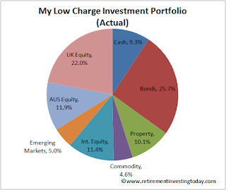
My Actual Low Charge Investment Portfolio
Click to enlarge, My Actual Low Charge Investment Portfolio

At a top level the portfolio contains local and International Equities, Commodities, Property, Bonds and Cash.

Saturday 30 May 2015

Insuring Against Sequence of Returns Risk with the State Pension

Anybody who is intending to retire (particularly those taking early retirement) without a healthy Defined Benefit Pension or without knowledge of a guaranteed healthy inheritance should be wary of and maybe even have a healthy fear of sequence of returns risk.  It is the risk of receiving a series of investment returns that are negative (or lower) during a period when you are in portfolio/wealth drawdown which then never allows your wealth to recover even when investment returns normalise.

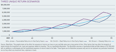
Blackrock have a couple of charts which demonstrate the phenomena nicely.  Firstly, let’s look at Sequence of Returns during the Wealth Accrual Phase (ie before Retirement).  The chart below shows 3 investors who each make an initial investment of $1,000,000 at age 40 and then never invest again.  Each has an average annual return of 7% but each experiences a different sequence of returns.  25 years later each has the same portfolio value even though valuations varied along the way.

Sequence of Returns during Wealth Accrual Phase
Click to enlarge, Sequence of Returns during Wealth Accrual Phase

Now let’s look at Sequence of Returns during the Wealth Drawdown phase.  Again we have our 3 investors making the same initial $1,000,000 investment, the same average annual return of 7% with annual returns following the same sequences as during the Wealth Accrual Phase.  25 years later each have very different portfolio values with Mr White now forced to beg for food under a bridge.

Saturday 23 May 2015

Valuing the UK Equities Market (FTSE 100) - May 2015

My investment strategy requires me to moderate my equity holdings based upon my view of current equity market values.  I run this valuation monthly for the Australian (currently targeting 15.5% of total portfolio value at current valuation vs 17% at fair value), US (as a proxy for my international equities and currently targeting 10.4% vs 15%) and UK (currently targeting 19.0% vs 20%) Equity markets.  Let’s look at the UK Equity market in more detail.

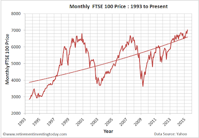
Firstly nominal values.  Between yesterday and the 1st April 2015 (“month on month”) prices are up 3.3% and since the 1st May 2014 (“year on year”) prices are also up 3.3%.

Chart of the FTSE 100 Price
Chart of the FTSE 100 Price, Click to enlarge

Regular readers will know I’m not a fan of this type of chart as:
  • the unit of measure, £’s, is being constantly devalued through inflation (although in the current market one wonders for how much longer); plus
  • Pricing should be plotted on a logarithmic scale as opposed to a linear one as by using this scale percentage changes in Price appear the same.  

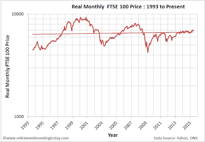
So let’s correct the chart for the devaluation of the £ through inflation (I use the Consumer Price Index (CPI) here) and convert to a log chart.  This normalised chart shows that Friday’s FTSE 100 Price of 7,031 is actually still 25% below the Real high of 9,331 seen in October 2000.  We’re also still 14% below the last Real cycle high of 8,164 seen in June 2007.

Chart of the Real FTSE100 Price
Chart of the Real FTSE100 Price, Click to enlarge