Monday 31 December 2012

RIT Reader EBook Plug – Slow and Steady Steps from Debt to Wealth

A Retirement Investment Reader, John Edwards, yesterday kindly sent me a copy of his EBook Slow & Steady Steps from Debt to Wealth. It’s a very easy read and at a little over 7,000 words can be devoured for the first time with a cup of tea. That said, doing something with the common sense approach will certainly take a little more time... I’ve been on a similar journey to the one described and I’m now 5 years in and still learning.

I’m plugging it because there is lot of commonality with the message I try and promote on Retirement Investing Today. The difference is that I fear that I sometimes over complicate the problem where John lays out a series of steps that go from debt (this site doesn’t really cover debt and instead starts with someone possessing £0) to a healthy investment portfolio.

Let’s look briefly at each of the Chapters in turn:
1. Avoid Debt. One sentence rams it home – “The first step to financial freedom is to avoid debt in the first place”. I couldn’t agree more.

2. Over Consumption. We are encouraged to answer two questions – “Do I really need this?” and “Do I really want this?” I probably push this concept more than most people could tolerate but it’s one of the ways I can regularly save 60% of my earnings.

3. Start Saving. This was the starting point in my KISS Investing for Retirement post.

4. Pension. “I had a variety of pension pots ... none were performing all that well and one reason for this was the high charges being levied every year.” I also believe that it is critical to minimise those charges and have it as one of the fundamentals of my Low Charge Strategy. I don’t understand how people can be so blasé and just accept say a 1% charge without question. Given that a reasonably balanced portfolio might only on average return 4% after inflation you could be giving 25% of your return away. John also makes another good point with the statement people “often don’t fully appreciate how much they need to save”. My belief is that you are not going to reach true financial independence early by saving 10% a year.

Sunday 30 December 2012

Allocation to UK Equities

My Low Charge Investment Strategy requires a strategic nominal asset allocation to UK Equities of 20% of total portfolio value.  I then add my tactical asset allocation spin which given the current valuation of the FTSE100 requires that allocation be lowered slightly to 19.6%.  My current allocation is spot on 19.6% with allocations to all asset classes shown in the chart below.

Click to enlarge

Over the past couple of years I have been able to move my UK Equities investments into a position where I feel they are now relatively low expense and tax efficient.  Let’s look in a little more detail.

My UK Equities are now divided into two simple pots.  The first pot is 16.4% of the allocation.  This is all located within the Vanguard FTSE UK Equity Index Fund which is located within a Sippdeal SIPP wrapper.  I chose the Vanguard fund as it has good tracking of the performance of the FTSE All Share Index, which contains household names like HSBC, BP, Vodafone, Shell, GlaxoSmithKline, British American Tobacco, Diageo, BHP and Rio Tinto, while having a Total Expense Ratio (TER) of only 0.15%.  Note that on initial purchase you are subjected to a Preset Dilution Levy (SDRT) of 0.5% however this was not a major factor for me as I intend to hold the majority of this fund forever meaning this charge will become insignificant. 

The Sippdeal SIPP wrapper also subjects me to some extra expenses which are online dealing fees of £9.95 per purchase and a quarterly custody charge of £12.50, which covers all the funds within my Sippdeal pension.  For me Sippdeal was the cheapest pension wrapper for the asset types held with these fixed charges, as opposed to a percentage of asset value, helping as my SIPP pot is now relatively large.  Vanguard plus the Sippdeal wrapper have helped me reduce my costs significantly as the funds came from two old work Group Personal Pensions (GPP) which were both held with Aviva and were incurring high expenses of 0.85% and 1%.

Friday 28 December 2012

The RIT High Yield Portfolio (HYP) – Adding VOD plus the New Contenders

The full detail on what a High Yield Portfolio (HYP) is, why I decided to build one and full detail on my initial selection can be found in my original post on the topic.  This post builds on that original HYP post and so is important reading for any newcomers to Retirement Investing Today.

Wealth Warning: As I said in the original post I don’t know if long term this HYP strategy will work.  There is every chance that a simple diversified portfolio of lowest expense index trackers that are invested tax effectively will in the long term outperform this strategy.  Only time will tell.

In November 2011 I added my first 3 HYP companies.  These were AstraZeneca (LSE ticker: AZN), Sainsbury’s (LSE ticker: SBRY) and SSE (LSE ticker: SSE).  I’m writing this post as late last week I added my 4th company, Vodafone (LSE ticker: VOD), for which I had to pay £1.552 per share.  This purchase was funded by moving 0.8% of my Low Charge Investment Portfolio assets from cash.  It takes the HYP portion of my Portfolio to 3.2% of total assets.

It’s been over a year between purchases.  The HYP is counted as part of the UK Equities allocation within my non-emotional mechanical investment strategy.  With the majority of that currently being FTSE All Share Trackers, which have risen nicely over that period, I have been given no opportunity to buy with either new money or rebalancing.

Reviewing the High Yield Portfolio

In my original post I stated that “The first priority is to amass 15-20 shares (minimise company risk), from different industries (minimise sector risk), from the FTSE 100 (minimise stability risk) that you believe will spin off dividends that rise at or above the rate of inflation.”  The purchase of Vodafone means I am still a long way from a mature HYP with a need to purchase shares in a further 11 to 16 companies.  All 4 companies to date are from different industries and are from the FTSE100.  Year on year all have increased their dividends at or above the rate of inflation – SBRY by 6.6%, AZN by 9.1% (once converted from $’s to £’s), SSE by 6.8% and VOD by 7.0%.

With the first priority met my second priority was “to maximise the capital growth ... of the portfolio” which will “ideally be an outperformance when compared to the UK market.”  To account for purchases at different times, which I need to do if I am to benchmark myself against the FTSE100, I unitise my HYP.  Since purchase my HYP units have risen by 12.3% and calendar year to date they are up 8.1%.  This compares favourably against the FTSE100 which with a Price of 5,951 at the time of writing is up 12.0% and 6.8% respectively. 

All have provided a dividend yield above that of the FTSE100’s current 3.69%.

Saturday 22 December 2012

UK House Value vs UK House Affordability – December 2012

This is the monthly UK House Affordability update which is the metric that I believe is the key driver of UK House Prices.  It is also the update for UK House Value which is the metric I am using to assess when it is time to buy a UK home. 

Let’s first update the key data being used to calculate both UK House Value and UK House Affordability:
  • UK Nominal House Prices.  In recent posts we have been comparing the different UK House Price Indices however for this analysis we will stay with the Nationwide Historical House Price dataset.  November 2012 house prices were reported as £163,853.  Month on month that is a fall of £300 (-0.2%).  Year on year sees a decrease of £1,945 (-1.2%).
  • UK Real House Prices.  If we account for the devaluation of the £ through inflation (the Retail Prices Index) we see a very different story.  Month on month that £300 decrease stays at £300 as we say no inflation in the last month however year on year that £1,945 decrease grows to £6,879 (-4.2%).  In real terms prices are now back to those around March 2003. 
  • UK Nominal Earnings.  I choose to use the Office for National Statistics (ONS) Average Weekly Earnings KAB9 dataset which is the seasonally adjusted average weekly earnings of both the public and private sector including bonuses.  October 2012 sees earnings at £471.  Month on month that is an increase of precisely £0.  Year on year the increase is £7 (1.5%).  With inflation (the Retail Prices Index) running at 3.2% over the same yearly period purchasing power of those that work continues to be eroded.
  • UK Mortgage Rates.  The proxy I use to monitor mortgage interest rates is the Bank of England dataset IUMTLMV which is the monthly interest rate of UK resident banks and building societies sterling Standard Variable Rate (SVR) mortgage to households (not seasonally adjusted).  November 2012 sees this reach 4.33% which month on month is a tiny uptick of 0.01% and year on year is an increase of 0.22%.  So while the Bank of England holds the Bank Rate at 0.5% out in the real world we are seeing mortgages creeping up at glacial speeds. 

Thursday 20 December 2012

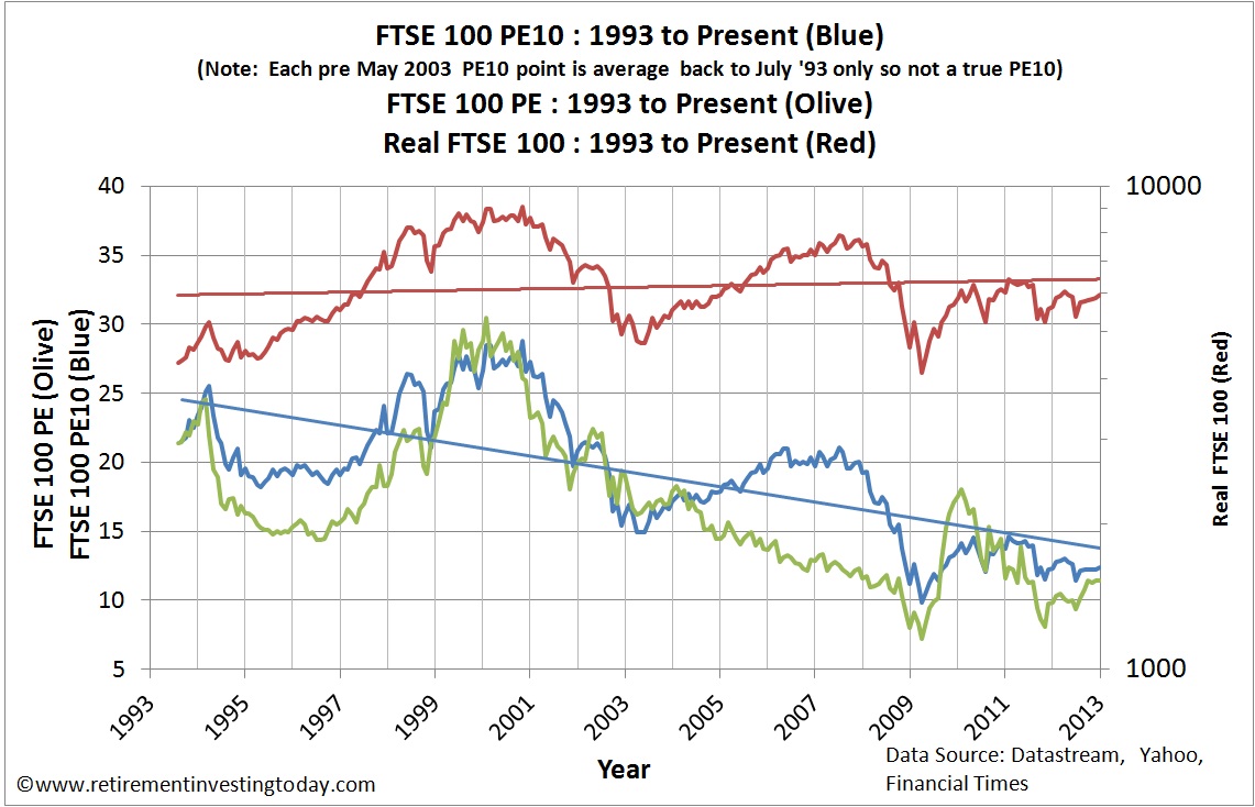
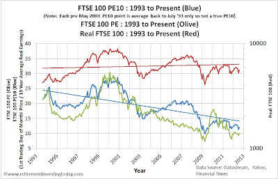
The FTSE 100 Cyclically Adjusted PE Ratio (FTSE 100 CAPE or PE10) – December 2012 Update

This is the Retirement Investing Today monthly update for the FTSE 100 Cyclically Adjusted PE (FTSE 100 CAPE).  Last month’s update can be found here.

As always before we look at the CAPE let us first look at other key FTSE 100 metrics:
  • The FTSE 100 mid market Price is currently 5,960 which is a gain of 1.7% on the 01 November 2012 Price of 5,862 and 8.6% above the 01 December 2011 Price of 5,489.
  • The FTSE 100 Dividend Yield is currently 3.73% which is flat against the 01 November 2012 yield of 3.71%.
  • The FTSE 100 Price to Earnings (P/E) Ratio is currently 11.46.
  • The Price and the P/E Ratio allows us to calculate the FTSE 100 As Reported Earnings (which are the last reported year’s earnings and are made up of the sum of the latest two half years earnings) as 520.  They are up 1.2% month on month and down 7.1% year on year.  The Earnings Yield is therefore 8.7%.

The first chart below provides a historic view of the Real (CPI adjusted) FTSE 100 Price and the Real FTSE 100 P/E.  The second chart provides a historic view of the Real Earnings along with a rolling Real 10 Year Earnings Average for the FTSE 100.

FTSE100 PE10, FTSE100 P/E Ratio and FTSE100 Real Price
Click to enlarge

FTSE100 Real Earnings
Click to enlarge

Saturday 15 December 2012

Save Hard, Invest Wisely, Retire Early

In some of my posts I feel like I’m only one step away from preaching. This is not what the site is all about. Instead I’m trying to sow some seeds which give enough information to encourage readers to go off, do their own research and make some of their own decisions away from the so many vested interests that want your money today. Today I’d like to run a case study on myself to see if I’m practicing what I “preach” and whether the seeds I’ve sown are actually growing.

I’m going to break this down into 3 sections which broadly cover everything that this site is about – Save Hard, Invest Wisely, Retire Early. Before we go there let us first set the scene. I graduate in 1995 with precisely £0 worth of assets. I start living my life like most others – get a job, start consuming, get myself into debt with a car, then get myself into debt with a house and finally save a few percent with the scraps that are leftover both personally and through an employer defined contribution pension. 2007 comes around quickly and I have one of those light bulb moments. While preparing some financial documents I actually calculate how much I’ve earned over those 12 years and looked at how much I had to show for it. It was a scary moment where I realised something had to change.

Not realising I was probably no different to 99% of the population I immediately assumed I was well behind the curve. I thought if I was to catch up I needed some professional help and so I visited a few Independent Financial Advisor’s (IFA) with a view to picking one to help me. After the meetings I sat down and thought a little about what I’d just been through. It all sounded so impressive and clever but working through each point in turn made me feel that they were deliberately trying to make it sound complicated. It was also at about the same time that I saw the book Where Are the Customers' Yachts? I made a decision. I was going to take responsibility for my own actions and control my own destiny. If it worked I could proudly say I’d done it and if it didn’t then I only had myself to blame. 2008 was then the year where I developed the strategy that you largely see me using today. I made some mistakes but it was largely positive. Then in 2009 this site was launched and I’ve been staying the course ever since. So what is that course? Let’s visit those 6 words again - Save Hard, Invest Wisely, Retire Early.

Thursday 13 December 2012

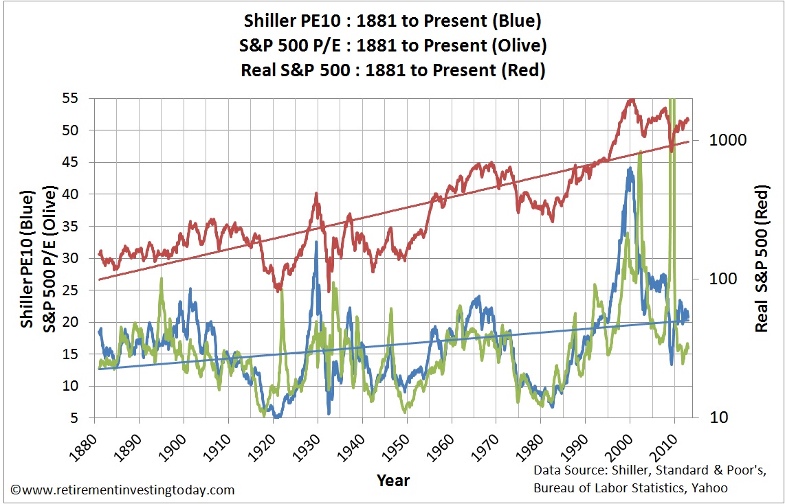
The S&P 500 Cyclically Adjusted PE (aka S&P 500 or Shiller PE10 or CAPE) – December 2012 Update

This is the Retirement Investing Today monthly update for the S&P500 Cyclically Adjusted PE (S&P 500 CAPE).  Last month’s update can be found here.

As usual before we look at the CAPE let us first look at other key S&P 500 metrics:
  • The S&P 500 Price is currently 1,417 which is a rise of 1.6% on last month’s Price of 1,395 and 14.0% above this time last year’s monthly Price of 1,243.
  • The S&P 500 Dividend Yield is currently 2.1%.
  • The S&P As Reported Earnings (using a combination of actual and estimated earnings) are currently $87.77 for an Earnings Yield of 6.2%.
  • The S&P 500 P/E Ratio is currently 16.1 which is down from last month’s 16.0.
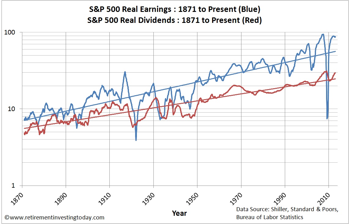
The first chart below provides a historic view of the Real (inflation adjusted) S&P 500 Price and the S&P 500 P/E.  The second chart below provides a historic view of the Real (after inflation) Earnings and Real (after inflation) Dividends for the S&P 500.

S&P500 Real Price, S&P500 P/E and S&P500 PE10 (CAPE)
Click to enlarge

S&P500 Real Earnings and S&P500 Real Dividends
Click to enlarge

Sunday 9 December 2012

Comparing UK House Prices – December 2012 Update

There are a multitude of UK House Price Indices out there.  The last time we looked at the more common ones was here.  Following some more data analysis work this month I feel as though we now have enough data and understanding to make this a regular feature.  The best starting point is to firstly move away from the popular indices and get a visual look at the raw data as a picture tells a thousand words.  The data is the actual sales of property in England and Wales for the month of October 2012 and comes courtesy of the Land Registry.  I plot this data (shown in blue) as a histogram below.  To help you see the changes that have occurred over the last month I also show last month’s data in red.  


Click to enlarge

The distortions caused by the government in the form of Stamp Duty Land Tax (SDLT) thresholds continue to be clearly visible at £125,000, £250,000 and £500,000.  The other key observation is that the number of registered sales has risen from 64,173 in September to 74,934 in October.  Note that the right hand bar is all house sales that are of a value greater than £600,000.

Thursday 6 December 2012

Australian Property Price to Income Ratios*

Looking at real estate price to income ratios can give a good indicator about whether or not now is a good time to buy property in Australia. Although housing prices have remained high throughout the past decade despite a global economic downturn, have incomes followed suit? In looking at prices from 2010-2011, home prices fell slightly while incomes have risen. According to a 2011 press release from realestate.com.au, mortgage payments comprised 34% of average household income in 2010, but this number declined to 32% in 2011. This has made housing slightly more affordable across the nation.

Fluctuations in Price to Earnings Ratios

Interest rates play a role in the affordability of Australian housing, and can experience a variety of ups and downs over the span of a 30-year loan. This is important to remember when you're deciding whether or not to invest. The ratio of house prices to household earnings has increased 2.5 times since 1970, with the biggest increase seen in the early 2000s. The ratio doubled during that period, even with more houses having two income earners. According to figures published by The Motley Fool, the average first home loan has gone up from $75,000 20 years ago to nearly $300,000 today. This doesn't match the corresponding rise in income. The average first home loan was 3.1 times the average income in 1994, but it is now 5.6 times the average household earnings, putting first-time homebuyers further into debt.

Average house prices in many Australian cities have continued to increase over the past several years. According to a survey conducted by Demographia, Sydney is the third-least affordable city in the world when price to earnings ratios are taken into account. Figures from the Australian Bureau of Statistics show that house prices rose in 5 out of 8 of Australia's major cities between September 2011 and September 2012. Prices climbed by 8.2% in Darwin and 4.4% in Perth, while they fell 1.1% in Adelaide. This indicates that now may be a good time to find property in Adelaide with Homesales or other listings services, while it may be better to hold off in Perth.

Tuesday 4 December 2012

Gold Priced in British Pounds (GBP or £’s) – December 2012 Update

This is the regular gold priced in Pound Sterling update.  The last update was in August 2012 and can be found here.

The chart below shows the Nominal Monthly Gold Price since 1979.  The key Nominal Gold metrics are:
  • The Nominal Gold Price is currently £1,051.97 which is 2.4% below the November 2012 Price of £1,078.37.
  • Year on Year Nominal Gold is 0.3% below the December 2012 Price of £1,055.00. 
Monthly Gold Price in £'s
Click to enlarge

So over the past year in nominal terms gold has gone precisely nowhere.  This demonstrates nicely one of the negatives of holding gold compared to equities.  If equities go nowhere price wise for a year you can still sleep easy knowing your equities (ie real world companies) are (hopefully) making profits.  Some of those profits are then (hopefully) spun off as dividends, particularly if your allocation to equities is HYP based, which gold doesn’t give you.  That said I’m not changing my strategy and will continue to hold gold because of its diversification benefits.

Saturday 1 December 2012

Stop acting like a victim

A couple of weeks ago I posted the article KISS Investing for Retirement.  This looked at what I believe was a simple strategy to achieve financial independence.  The first point, which was simply Start, really rang true this week when I read the BBC article Pension Planning ‘Inadequate’ Among Over 50’s.  The article itself wasn’t the kicker for me as it was essentially just an advertisement from the National Association of Pension Funds.  The bit that made me think was reading some of the comments.

If people are to Start down the road towards achieving financial independence then they must first stop acting like victims and must stop blaming others.  Instead they need to start taking responsibility for their own actions.  Of course it’s easy to play the victim because then you don’t have to change your ways and can keep your head buried in the sand.  Let’s briefly look at a couple of the 378 comments that this article received.  (Full disclosure:  I only read the first page of comments by which time I was shouting take some responsibility at my laptop screen so loudly I felt it prudent to stop reading)

Wednesday 28 November 2012

UK Average Weekly Earnings – November 2012 Update

Are you one of the 29.58 million people over the age of 16 working in the United Kingdom?  Do you feel like it’s getting harder to save or survive to payday depending on your goals in life?  Worry no longer because the answer is that it is.  If you are an average earner your salary is now back to levels last seen in September 2001.  As always on Retirement Investing Today let’s look at the data.

The Office for National Statistics reports that the Average Weekly Earnings for the Whole Economy including bonuses and allowing for seasonal adjustment is now £471.  This is nominally £2 less per week than last month and is the nominally similar to that of April 2012.  Annualised this is £24,492.  Breaking this figure down between the Public Sector and the Private Sector reveals the Public Sector to be still coming out on top by some 4%.  The Average Public Sector employee earns £488 per week (up 2.1% year on year) compared to that of the Private Sector which funds those earnings (of course in conjunction with a lot of government borrowing) at £467 (up 1.7% year on year).

Sunday 25 November 2012

The FTSE 100 Cyclically Adjusted PE Ratio (FTSE 100 CAPE or PE10) – November 2012 Update

This is the Retirement Investing Today monthly update for the FTSE 100 Cyclically Adjusted PE (FTSE 100 CAPE).  Last month’s update can be found here.

As always before we look at the CAPE let us first look at other key FTSE 100 metrics:
  • The FTSE 100 Price is currently 5,819 which is flat against the 01 October 2012 Price of 5,820 and 7.3% above the 01 November 2011 Price of 5,422.
  • The FTSE 100 Dividend Yield is currently 3.71% which is also flat against the 01 October 2012 yield of 3.72%.
  • The FTSE 100 Price to Earnings (P/E) Ratio is currently 11.41.
  • The Price and the P/E Ratio allows us to calculate the FTSE 100 As Reported Earnings (which are the last reported year’s earnings and are made up of the sum of the latest two half years earnings) as 510.  They are down 1.0% month on month and down 7.9 year on year.  The Earnings Yield is therefore 8.8%.

Thursday 22 November 2012

Is it really that novel, innovative and value adding a strategy?

Ok I’ll admit it.  I read the Investment Times which is a monthly publication issued by Hargreaves Lansdown.  It’s clearly a piece of marketing material aimed at keeping Hargreaves Lansdown fresh in your mind but I read it because occasionally I do find an interesting titbit that encourages me to go off and do some more research.  I’ve just received the December 2012 edition and within it there is a review of an actively managed fund called the Troy Trojan Fund.

Important: Before we get started, I must point out that what follows is not a recommendation to buy or sell anything, and is for educational purposes only. I am just an Average Joe and I am certainly not a Financial Planner.

I don’t normally comment on actively managed funds as I am a supporter of passive index funds however the Troy Trojan Fund promises a lot.  The manager “believes that sooner or later the inflationary effects of QE (Quantitative Easing) will take hold” however he also does not rule out the rule possibility of a ‘Little Ice Age’ of deflation beforehand”.  The fund manager has apparently prepared for both scenarios by building a portfolio around blue chip equities, index linked bonds, gold and cash.  The actual asset allocation is listed as:
  • 11% UK Equities
  • 20% Overseas Equities
  • 17% Cash (including UK T-Bills)
  • 7% Singapore T-Bills
  • 12% Gold
  • 6% Gold Shares
  • 13% US Index Linked Bonds
  • 14% UK Index Linked Bonds

Tuesday 20 November 2012

A deeper look at UK Inflation - November 2012

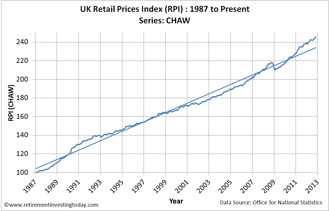
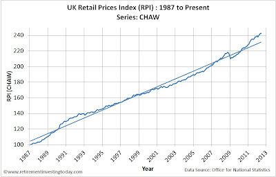
Last week we had the Office for National Statistics (ONS) announce that annual inflation to October, according to the Retail Prices Index (RPI), increased at the rate of 3.2% and that the Consumer Price Index (CPI) increased at the rate of 2.7%  The main contributor to the CPI increase was apparently University tuition fees, food and non-alcoholic beverages.  The main contributor to the RPI increase was the same as the CPI plus the addition of housing.  The Bank of England continues with their stance (at least their public stance) that inflation will fall back to its 2% target.  They’ve now been wrong on that since December 2009, a period where in my own line of work I would have long been sacked for being so wrong.  A long run view of the UK RPI can be seen in my first chart today.

UK Retail Prices Index (RPI)
Click to enlarge

In the period January 2000 to the present day inflation has increased by 47.4%!  This means:
  • if your earnings haven’t increased by this amount and your spending is in line with the RPI you have effectively taken a pay cut over that period;
  • if you’re saving for retirement then unless your savings have increased by at least this amount you are now further from retirement than you were; and
  • if you’re retired and your pension is in income drawdown then to just maintain your purchasing power your portfolio had to increase by at least this amount just to stand still.

Saturday 17 November 2012

The S&P 500 Cyclically Adjusted PE (aka S&P 500 or Shiller PE10 or CAPE) – November 2012 Update

This is the Retirement Investing Today monthly update for the S&P500 Cyclically Adjusted PE (S&P 500 CAPE).  Last month’s update can be found here.

As usual before we look at the CAPE let us first look at other key S&P 500 metrics:
  • The S&P 500 Price is currently 1,360 which is a fall of 5.4% on last month’s Price of 1,438 and 10.9% above this time last year’s Price of 1,226.
  • The S&P 500 Dividend Yield is currently 2.2%.
  • The S&P As Reported Earnings (using a combination of actual and estimated earnings) are currently $88.20 for an Earnings Yield of 6.5%.
  • The S&P 500 P/E Ratio is currently 15.4 which is down from last month’s 16.4.

The first chart below provides a historic view of the Real (inflation adjusted) S&P 500 Price and the S&P 500 P/E.  The second chart provides a historic view of the Real (after inflation) Earnings and Real (after inflation) Dividends for the S&P 500.

 Click to enlarge

Thursday 15 November 2012

KISS Investing for Retirement

Alright I’ll admit it.  Investing for retirement is my hobby.  This means that I continually run all sorts of detailed analysis, some of which I share on this site, to try and squeeze a little extra investment performance from my portfolio.  An added benefit of this particular hobby is that it’s a frugal type of activity which other than the cost of running this site really costs nothing at all other than an old laptop and an internet connection.  While this is my chosen behaviour I’m also the first to admit that I could probably remove 99% of the complexity and still get 99% of the result by following the Keep It Simple Stupid, KISS (bet you thought I was talking about an American Rock Band there for a while), rule.  Today let’s take a step back and look at what that effective 1% effort might entail to enable this 99% result.


Important: Before we get started, I must point out that what follows is not a recommendation to buy or sell anything, and is for educational purposes only. I am just an Average Joe and I am certainly not a Financial Planner.

1.    Start.  If you never decide to take control of your retirement planning then you will never achieve early retirement.  Instead you’ll retire when the government tells you to which sounds a bit depressing to me.

2.    Spend less than you earn.  Sounds obvious doesn’t it?  It mustn’t be because a lot of people fall at this hurdle by being in debt.  If you don’t spend less than you earn then you are never going to reach Early Retirement or even have a little extra than the State Pension provides if you retire at State Pension Age.  This I believe is a critical point as no matter what other decisions you make about your investments it all multiplies by the level of saving you are making.  The level of saving is I believe one of the key differences between Early Retirement Extreme, Early Retirement, Typical Retirement and Late Retirement.  You can start this saving lark long before you’ve completed any of the activities below, whether it be firstly paying down debt in readiness or simply saving it in a high interest savings account until you know what you want to do with it.

Wednesday 14 November 2012

Financial Divorce Implications at Retirement Age*

Divorce can have a significant emotional and financial impact during any stage in life, though this is often felt more acutely during retirement. The long-term impacts of a disrupted joint income need to be considered as well as the initial cost of divorce. Although the fees for a quick divorce may be relatively manageable, cases which come up against unforeseen complications can result in spiraling fees.

One member of a partnership may feel the effects of divorce during retirement more significantly if they have earned less over the years and therefore have a lower income from their pension. This may be most worrying for women, as research has shown that women in the UK are twice as likely to suffer from poverty in retirement than men. It has also been found that 70% of women face financial hardship following the death of or divorce from their husband.

Saturday 10 November 2012

A Comparison of UK House Prices – November 2012 Update

The last time we looked at UK House Price Indices we ended up with more questions than answers.  I believe there is now a simple answer to why that was the case which I’d like to demonstrate in today’s post.  To help with this we need to first take a step away from the published Rightmove, Nationwide, Halifax, Acadametrics and Land Registry House Price Indices and instead start with an analysis of some very raw data.  This data comes courtesy of the Land Registry and is the database of actual sales in England and Wales for the month of September 2012.  It is a list of 64,173 sales.  If we plot these sales as a histogram we end up with the chart below.


Click to enlarge

Sunday 28 October 2012

UK House Value vs UK House Affordability – October 2012

This is the monthly UK House Affordability update which is the metric that I believe is the key driver of UK House Prices.  It is also the update for UK House Value which is the metric I am using to assess when it is time to buy a UK home. 

Let’s first update the key data being used to calculate both UK House Value and UK House Affordability:
  • UK Nominal House Prices.  In recent posts we have been comparing the different UK House Price Indices however for now we will stay with using the Nationwide Historical House Price dataset for this topic.  September 2012 house prices were reported as £163,964.  Month on month that is a fall of £765 (0.5%).  Year on year sees a decrease of £2,292 (-1.4%).
  • UK Real House Prices.  If we account for the devaluation of the £ through inflation (the Retail Prices Index) we see a very different story.  Month on month that £765 decrease turns into a decrease of £1,761 (-1.1%) and year on year that £2,292 decrease grows to £6,880 (-4.2%).  In real terms prices are now back to those around March 2003. 
  • UK Nominal Earnings.  I choose to use the Office for National Statistics (ONS) Average Weekly Earnings KAB9 dataset which is the seasonally adjusted average weekly earnings of both the public and private sector including bonuses.  August 2012 sees earnings rise to £473.  Month on month that is an increase of £2.  Year on year the increase is £10 (2.2%).  With inflation (the Retail Prices Index) running at 2.9% over the same yearly period purchasing power of those that work continues to be eroded.
  • UK Mortgage Rates.  The proxy I use to monitor mortgage interest rates is the Bank of England dataset IUMTLMV which is the monthly interest rate of UK resident banks and building societies sterling Standard Variable Rate (SVR) mortgage to households (not seasonally adjusted).  September 2012 sees this reach 4.28% which month on month is a tiny uptick of 0.01% and year on year is an increase of 0.18%.  So while the Bank of England holds the Bank Rate at 0.5% out in the real world we are seeing mortgages creeping up very slowly. 

Wednesday 24 October 2012

The ASX 200 Cyclically Adjusted PE (aka ASX 200 PE10 or ASX200 CAPE) – October 2012 Update

This is the Retirement Investing Today monthly update for the Australian ASX 200 Cyclically Adjusted PE (ASX 200 CAPE).  The last update can be found here.

Before we run the analysis we need to discuss an anomaly with the dataset that has been built over many years.  The dataset is calculated using data published by the Reserve Bank of Australia.  I show a screen grab of this data below.  Reading this table I have always assumed that the columns “Dividend yield per cent per annum” and “Price/Earnings ratio” referred to the ASX200.  It turns out that this was a bad assumption and this month I have noticed some small print that highlights that these two columns actually refer to the MSCI Australia Index with all other columns being the ASX200.  This to me is just bizarre but if we want to continue with this dataset it looks like I am going to have to think outside the box as I’ve tried searching for new data that details the P/E and Dividend Yield of the ASX200 and not surprisingly drawn a blank.

 Click to enlarge

Saturday 20 October 2012

Does frugal living cause reclusive tendencies and limit career opportunities?

I started down the road to early retirement in 2007, with a step change in my attempts starting in 2009 when I also started this blog to hold myself accountable.  As detailed in the link above, one of the key methods I have chosen to help me reach early retirement is to move to a more frugal lifestyle.  This frugal lifestyle means I need less to live on per month which then has the knock on benefit of meaning that I can save more per month.  This then gives a further knock on benefit that I need a smaller Retirement Investing Today Low Charge Portfolio to retire on because I spend less per month.

My move to frugality did not happen overnight and was possible with two key direction changes.  The first was to get more value from the money I was currently earning.  Some of the techniques I have used (and continue to use) include:
  • Achieve the lowest price grocery bill possible whilst satisfying my taste buds;-    Ensure I am on the lowest cost tariffs for electricity, gas, broadband and mobile phone;
  • Wait until shoes and clothes wear out rather than become unfashionable;
  • Stop everyday little treats that really made no impact on the lifestyle I want to lead;
  • Cut back on alcohol which also means less regular nights out (this also had a very noticeable effect on both my health and the sharpness of my mind);
  • Generally shunning consumerism; and
  • Before buying something always ask myself will this make a difference to my life 3 months from today.  This means I own very few gadgets.

Wednesday 17 October 2012

The FTSE 100 Cyclically Adjusted PE Ratio (FTSE 100 CAPE or PE10) – October 2012 Update

This is the Retirement Investing Today monthly update for the FTSE 100 Cyclically Adjusted PE (FTSE 100 CAPE).  Last month’s update can be found here.

As always before we look at the CAPE let us first look at other key FTSE 100 metrics:
  • The FTSE 100 Price is currently 5,911 which is 2.6% above the 03 September 2012 Price of 5,758 and 16.5% above the 03 October 2011 Price of 5,076.
  • The FTSE 100 Dividend Yield is currently 3.70% which is a slight fall from the 03 September 2012 yield of 3.75%.
  • The FTSE 100 Price to Earnings (P/E) Ratio is currently 11.43.
  • The Price and the P/E Ratio allows us to calculate the FTSE 100 As Reported Earnings (which are the last reported year’s earnings and are made up of the sum of the latest two half years earnings) as 517.  They are up 2.3% month on month and down 17.7% year on year.  The Earnings Yield is therefore 8.7%.

Sunday 14 October 2012

A Comparison of UK House Prices (Formerly The Greater Fool UK House Price Index) – October 2012 Update

This is the monthly update that compares the various UK House Price Indices.  The previous update can be found here.  Since the last post I have engaged in some good debate with Retirement Investing Today readers which has then encouraged me to undertake some further reading around this topic.  This has resulted in this regular topic seeing a number of direction changes which you will notice as you read on.  The first of these is that from here on in this regular post will not be referred to as the Greater Fool Index.  This title encouraged emotion and an inherent bias.  This blog is not about either of those things and so I must drive the title back to one that is emotionless and mechanical.  Not quite as exciting I know but hopefully of more use for making the right investing decisions moving forward.

It’s also important to note that this topic is also a work in progress and is not yet mature.  Therefore as you’ve already done previously please feel free to comment on the analysis so that we can further improve the data for all readers.

Let us first look at the five datasets that will be used for ongoing analysis:
  • The Rightmove House Price Index.  This index simply tracks the average asking prices of properties as they come onto the market.  This means it will be affected by price changes, if the mix of house type changes and if the mix of location changes for houses coming onto the market.  It is not seasonally adjusted and covers properties from England and Wales.  Asking prices in September were £234,858 which month on month is a fall of 0.6% and year on year is an increase of 0.7%.
  • The Acadametrics House Price Index.  This index is new for this blog and uses the Land Registry dataset.  It mix adjusts this dataset to take a constant proportion of property types, from a constant mix of geographic areas.  It is seasonally adjusted and covers properties from England and Wales.  It covers buyers using both cash and mortgages.  Buying prices in September were £225,374 which month on month is a small fall of 0.1% and year on year is an increase of 2.2%.
  • The Halifax House Price Index.  This index is based on buying prices of houses where loan approvals are agreed by Halifax Bank of Scotland.  It uses hedonic regression to remove type and mix variations thereby measuring the price of a standardised house.  I use the non seasonally adjusted dataset and it covers the complete United Kingdom.  Sales prices in September were £160,437 which month on month is a rise of 0.2% and year on year is a fall of 1.2%. 
  • The Nationwide House Price Index.  This index is very similar to that of the Halifax except it is based on buying prices of houses where loan approvals are agreed by Nationwide Building Society.  Sales prices in July were £163,964 which month on month is a fall of 0.5% and year on year is a fall of 1.4%. 
  • The Land Registry House Price Index.  This index uses repeat sales regression on houses which have been sold more than once to calculate an increase or decrease.  This is then combined with a mean price which was taken in April 2000 to calculate the index.  It is seasonally adjusted and covers properties from England and Wales.  It covers buyers using both cash and mortgages.  Sales prices in August were £163,376 which month on month shows no movement and year on year is an increase of 0.7%. 

Thursday 11 October 2012

The S&P 500 Cyclically Adjusted PE (aka S&P 500 or Shiller PE10 or CAPE) – October 2012 Update

This is the Retirement Investing Today monthly update for the S&P500 Cyclically Adjusted PE (S&P 500 CAPE).  Last month’s update can be found here.

As usual before we look at the CAPE let us first look at other key S&P 500 metrics:
  • The S&P 500 Price is currently 1,435 which is 0.6% below last month’s Price of 1,443 and 18.8% above this time last year’s Price of 1,207.
  • The S&P 500 Dividend Yield is currently 1.97%.
  • The S&P As Reported Earnings (using a combination of actual and estimated earnings) are currently $88.87 for an Earnings Yield of 6.2%.
  • The S&P 500 P/E Ratio is currently 16.2 which is down from last month’s 16.3.

Thursday 4 October 2012

Guest Posting on Monevator

Today I’m guest posting the 2nd Private Investor Market Roundup on Monevator.  The workload that goes into that post means there won’t be a mid week post on Retirement Investing Today.  The Roundup covers Quarter 3 2012 and in my usual non-emotional fact based analysis is looking at:
  • The stock markets of the top 10 countries by GDP including pricing (both nominal and real), P/E and Dividend Yield.  The countries are the US, China, Japan, Germany, France, Brazil, UK, Italy, Russia and Canada.
  • The nominal and real HaliWide Index which is the average of both the Halifax and Nationwide House Prices Indices.
  • The nominal and real performance of commodities including Gold, WTI Spot Crude, Soyabeans, Copper and Natural Gas.

Sunday 30 September 2012

The Retirement Investing Today Low Charge Strategy and Portfolio

This blog is fast approaching its third anniversary.  In my first naive post I laid out in very brief terms “what” some of my investing strategy was about having developed it from the decision to go DIY in 2007.  This post also briefly described “why” I was taking the road I had chosen.  Soon after I laid out in detail the construction of what I called My Low Charge Investment Portfolio.  To this day I have continued to improve on the original portfolio methodology ever so slightly while holding true to the fundamentals of the strategy.  Since October 2009 that strategy and portfolio has seen my net worth increase by 73% in nominal terms.  Additionally, since October 2007 my net worth has increased by 306%.

Since that first post I have made 239 posts covering many topics.  If you’re interested some of the latest or most popular can be found in the sidebar.  Every post can also be found in the blog archive also found in the side bar.  While it’s all there as a fully accountable record I’m going to use today’s post to bring a number of my key fundamentals which cover strategy, portfolio and portfolio rebalancing into one single aide memoir.
Retirement Investing Today Strategy

The strategy is set around a decision to retire as early as possible.  It’s important to note that retirement for me does not mean a life of leisure.  It simply means that work becomes optional.  I may choose to stay in my current career, may start a new career which could involve voluntary work or it could be a life of leisure.  I don’t intend to make that decision today as anything can happen between now and retirement.  At the time of writing this post my portfolio models show my early retirement window appearing in around 3.5 years when I will be in my early 40’s.

Thursday 27 September 2012

A win win for all

I started Retirement Investing Today with a vision of both holding myself accountable and developing a small community of like minded individuals.  This has been achieved however in the last couple of months as readership has risen by some 60% from the previous peak it has brought with it a lot of new Comments from readers.  These are from people who both share experiences along similar lines to the road that I am travelling and importantly also bring alternative views for consideration.  These Comments are clearly bringing great benefits including:
  • I get to read about different ideas and thoughts, which then encourages me to read and understand more, which then helps me with my own strategy.  If that strategy works then I can share it with you and even if it doesn’t I can share that also.
  • You get to read about ideas and thoughts which hopefully encourage you to do more research on various topics resulting in new learning.
  • By getting differing opinions we all avoid confirmation bias.
  • One that I never even considered is that we are even starting to get some debate between readers within the comments which brings even more knowledge to the table.

Sunday 23 September 2012

The Dow has not reached 5 year highs (Severe Real S&P500 Bear Markets) – September 2012

I admit that over the past few weeks the US stock market has been a little bullish and has put on some good short term gains.  I however have not been excited by what I have been seeing.  The press however seem to be exactly the opposite.  We’ve seen headlines like Dow Closes at 5-year high, Market milestone: Stocks return to late 2007 level and even the US version of The Motley Fool telling us How the Dow reached a 5-year high.

It really is unfortunate that we live in an era where not even the press feel the need to report facts and can get away with such sloppy journalism.  Firstly, in nominal terms the Dow Jones Industrial Average (DJIA) has not reached a 5 year high.  According to Google Finance within the last 5 years in nominal terms the best DJIA close we have seen has been 14,164 on the 09 October 2007.  In comparison in this recent bull market the best close we have seen has been 13,596 on the 20 September 2012.  I make that a gap of 4.0% so not what I would call a high.  The full 5 year story can be seen in my first chart which comes from Yahoo Finance.

 5 Year Nominal DJIA Chart (Click to enlarge)

Thursday 20 September 2012

UK House Value vs UK House Affordability – September 2012

Over the past few months I have been exploring what actually drives UK House Prices.  In developing some mechanical non-emotional datasets I’ve come to the conclusion that the driver is actually UK House Affordability.  That said while Affordability drives the housing market I personally only want to buy a house when it is at a sensible Valuation.  Therefore from here on in I intend to monthly monitor two key UK House metrics:
  • I will monitor UK House Affordability which will hopefully give me some insight into whether house prices will be increasing or decreasing in the foreseeable future.
  • As I remain in rented accommodation and intend to buy when prices are fairly valued I will also monitor UK House Value.  This will hopefully give me a sensible buy point to ensure I don’t lose money on the purchase.

Before we look at the metrics let’s first look at the key pieces of data I am using to assess both Value and Affordability:
  • UK Nominal House Prices.  I have consistently been using the Nationwide Historical House Price dataset for a lot of previous analysis and so will stick with it.  August 2012 house prices were reported as £164,729.  Month on month that is an increase of £339 (0.21%).  Year on year sees a decrease of £1,185 (-0.72%).
  • UK Real House Prices.  If we account for the devaluation of the £ through inflation (the Retail Prices Index) we see a very different story.  Month on month that nominal increase turns into a decrease of £263 (-0.16%) and year on year that decrease grows to a larger £6,031 (-3.66%).  In real terms prices are now back to those seen in March 2003. 
  • UK Nominal Earnings.  I choose to use the Office for National Statistics (ONS) Average Weekly Earnings KAB9 dataset which is the seasonally adjusted average weekly earnings of both the public and private sector including bonuses.  July 2012 see earnings at £471.  Month on month that is an increase of exactly £0.  Year on year the picture is not much better with an increase of £6 (1.27%).  With inflation (the Retail Prices Index) running at 3.2% over the same yearly period purchasing power of those that work continues to be eroded.
  • UK Mortgage Rates.  The proxy I use to monitor mortgage interest rates is the Bank of England dataset IUMTLMV which is the monthly interest rate of UK resident banks and building societies sterling Standard Variable Rate (SVR) mortgage to households (not seasonally adjusted).  August 2012 saw this reach 4.26% which month on month is an increase of 0.02% and year on year is an increase of 0.16%.  So while the Bank of England holds the Bank Rate at 0.5% out in the real world we are seeing mortgages start to cost more, even if it is happening very slowly. 

Sunday 16 September 2012

It’s Just a Cup of Coffee – More on Compound Interest

To enable me to regularly save around 60% of my earnings I follow three philosophies within my life. 

Firstly live well within my means.  A simple example that has a big impact is the decision to currently rent for a number of reasons including this and this.  Given that my rental is not my forever home I make some compromises and live in a property that is significantly more modest than what I can afford.  This decision then compounds as by choosing to live in a smaller property heating, lighting and Council Tax bills are also a fraction of what they would be were I to have that larger property.  This adds up to significant savings which are then invested.

Secondly I have opted out of consumerism, do not value image and am not swayed by advertising.  In fact I find that I no longer even notice advertising.  Instead I buy only what I need and when buying I spend the minimum that will give me the quality I desire.  This means I have not purchased an Apple iPad as my old laptop is more than sufficient and still working well even though the battery no longer holds charge.  It also means I do not have an expensive iPhone on an expensive monthly contract as I have decided that I don’t need instant internet gratification at any time of the day or night.  Instead I choose to access the internet as much as I like for a lot less than £10 per month whenever I am at home.  It also means that when I go shopping I buy the cheapest grocery items that will meet my quality needs.  If I want to cook myself a Full English Breakfast on a Sunday morning I’m not too proud to use Tesco Everyday Value Baked Beans at £0.26 for a 420g can versus the nicely marketed Heinz Baked Beans at £0.70 for a slightly smaller 415g can.  All of that frees up yet more cash.

Wednesday 12 September 2012

The FTSE 100 Cyclically Adjusted PE Ratio (FTSE 100 CAPE or PE10) – September 2012 Update

This is the Retirement Investing Today monthly update for the FTSE 100 Cyclically Adjusted PE (FTSE 100 CAPE).  Last month’s update can be found here.

As always before we look at the CAPE let us first look at other key FTSE 100 metrics:
  • The FTSE 100 Price is currently 5,782 which is a 1.2% above the 01 August 2012 Price of 5,712 and 6.7% above the 01 September 2011 Price of 5,419.
  • The FTSE 100 Dividend Yield is currently 3.74% which is a slight rise from the 01 August 2012 yield of 3.71%.
  • The FTSE 100 Price to Earnings (P/E) Ratio is currently 11.46 which is up 6.2% since the 01 August 2012 and 32.5% since the 01 September 2011.
  • The Price and the P/E Ratio allows us to calculate the FTSE 100 As Reported Earnings (which are the last reported year’s earnings and are made up of the sum of the latest two half years earnings) as 504.  Earnings are continuing to fall while Prices continue to rise.  They are down 4.7% month on month and down 19.5% year on year.

Sunday 9 September 2012

The Miracle of Compound Interest

The saying goes that “money doesn’t buy happiness”.  I firmly agree with this however I think the saying is also a little misleading and should be extended to say “money doesn’t buy you happiness but without a certain amount it’s going to be very difficult to be happy”.  Thankfully, I am not in the situation where I am heavily indebted or worse am heavily indebted and require the booming pay day loan industry to get by.  I can only imagine the pressure and stress that a life like that would put on both an individual and their family.

It is for this reason that I believe a basic level of personal finance should be taught at school.  What good is English, Mathematics, Sciences and the Arts if the earnings potential that those skills bring cannot be harnessed and maximised.  Within the personal finance module it would be compulsory to teach the miracle of Compound Interest.  I can’t help but feel that we would have less indebted people today in the UK if only more people understood how Compound Interest worked.  The sad thing also is that at its most basic form Compound Interest is such a simple concept.  It is nothing more than if you have an initial balance of money which has interest added to that balance, then provided you don’t withdraw that interest, from that moment on that added interest also earns interest.  It is nothing more and nothing less than that.

Thursday 6 September 2012

The S&P 500 Cyclically Adjusted PE (aka S&P 500 or Shiller PE10 or CAPE) – September 2012 Update

Stock markets today provided big rises after Mario Draghi announced that he plans to buy up the debt of his favourite PIGS.  The German DAX rose 2.9%, France’s CAC 40 rose 3.1%, the UK’s FTSE 100 was up 2.1% and the Spanish IBEX was up a large 4.9%.  Positive market responses were not limited to Europe with the US S&P 500 also up 1.9% as I write this post. 

Given these market moves let’s look at the Retirement Investing Today monthly update for the S&P500 Cyclically Adjusted PE (S&P 500 CAPE).  Last month’s update can be found here.

Before we look at the CAPE let us first look at other key S&P 500 metrics:
  • The S&P 500 Price is currently 1,430 which is 1.9% above last month’s Price of 1,403 and 21.8% above this time last year’s Price of 1,174.
  • The S&P 500 Dividend Yield is currently 1.98%.
  • The S&P As Reported Earnings (using a combination of actual and estimated earnings) are currently $88.59 for an Earnings Yield of 6.2%.
  • The S&P 500 P/E Ratio is currently 16.1 which is up from last month’s 15.9.

Saturday 1 September 2012

The Retirement Investing Today High Yield Portfolio (HYP)

In its purest form a High Yield Portfolio (HYP) is a strategy designed to develop an Income Stream, which then provides an alternative to purchasing an Annuity with your Pension Fund or other investments.  The first priority is to amass 15-20 shares (minimise company risk), from different industries (minimise sector risk), from the FTSE 100 (minimise stability risk) that you believe will spin off dividends that rise at or above the rate of inflation.  If you achieve this then your purchasing power is maintained or increased.

If you achieve the first priority then you can also look to target the second priority which is to maximise the capital growth (what so many fund managers chase) of the portfolio.  This will ideally be an outperformance when compared to the UK market.  Although I think that if one can achieve the first priority there is every chance you will get the necessary amount of the second to meet your Income Stream objectives.

Thursday 30 August 2012

Gold Priced in British Pounds (GBP) – August 2012 Update

This is the regular gold priced in Pound Sterling update for August 2012.  The last update was in May 2012 and can be found here.

The chart below shows the Nominal Monthly Gold Price since 1979. 

Click to enlarge

Monday 27 August 2012

Protecting Your Portfolio from Inflation – Index Linked Gilts (Linkers)

As a person who is not in debt and is saving hard for Retirement I am very conscious of the need to protect the purchasing power of my Retirement Investing Today Portfolio from the ravages of inflation.  Once I’ve done this I then need to work out how to get a real (after inflation) return.

If I am a debtor then inflation can help me as the real value of my debt becomes less as every day passes, however the opposite is true if you own assets.  Additionally, in a relatively low inflation environment, like we find ourselves today, it can be easy to ignore it.  In my opinion we just can’t afford to.  Even a small amount of annual inflation will wreak havoc on a non inflation protected portfolio over a relatively short period of time.

Thursday 23 August 2012

NS&I Index Linked Savings Certificates - Changes Announced

National Savings & Investments have announced changes to the way their Index Linked Savings Certificates operate.  These changes take effect on the 20 September 2012.  The link to the NS&I Announcement is here.

The change that hurts me the most is likely to be:
"penalty and loss of index-linking for cashing in early  
The penalty is equivalent to 90 days’ interest on the amount cashed in. And you’ll lose the index-linking on your whole Certificate for the investment year in which you cash in."
 
This is likely to hurt as should house prices resort to a sensible valuation I would likely liquidate all of my NS&I Index Linked Savings Certificates to maximise my deposit and hence minimise my mortgage rate.  Although at the rate we're going I won't have to worry about that for a long time.

Sunday 19 August 2012

Early Retirement Extreme vs Early Retirement vs Typical Retirement vs Late Retirement

There are a lot of Investment and Pension Calculators available online today.  They get you to plug in a number of pieces of data, make some assumptions and then tell you an answer.  This might be your total projected pension fund, your projected income or even the probability or reaching a financial goal.  I find these a useful tool and use them regularly except I find they have one failing.  They only ever give you a single answer based on the data you enter and don’t show you a helicopter view of how the various factors that Mr Market throws at you combined with the decisions made by the Average Investor interact.  I therefore decided to build a simple Retirement Investing Today model in Microsoft Excel and have found it informative.  I hope you do to and as always would welcome your feedback.

Before we look at the model let’s first look at why I decided to run this analysis in the first place.  In the circles that I move (both in the flesh and online) there seem to be broadly four types of Retirement at play.  Some people have planned for one type and achieved their goal but in many other instances people have planned for one and failed miserably.  How many times have your read or heard people say that I was on target to Retire by 50 (or some other random number) but then the market crashed and so now I’ll have to work a lot longer than planned.  Why do people get it so wrong?  I want to know so that I can avoid the same mistakes.

Thursday 16 August 2012

The FTSE 100 Cyclically Adjusted PE Ratio (FTSE 100 CAPE or PE10) – August 2012 Update

This is the Retirement Investing Today monthly update for the FTSE 100 Cyclically Adjusted PE (FTSE 100 CAPE).  Last month’s update can be found here.

As always before we look at the CAPE let us first look at other key FTSE 100 metrics:
  • The FTSE 100 Price is currently 5,835 which is a 3.4% above the 01 July 2012 Price of 5,641 and 13.7% above the 01 August 2011 Price of 5,130.
  • The FTSE 100 Dividend Yield is currently 3.69% having fallen back from 3.75% on the 01 July 2012.
  • The FTSE 100 Price to Earnings (P/E) Ratio is currently 11.23 which is up 10.7% since the 01 July 2012 and 19.3% since the 01 August 2011.
  • The Price and the P/E Ratio allows us to calculate the FTSE 100 As Reported Earnings (which are the last reported year’s earnings and are made up of the sum of the latest two half years earnings) as 520.  Of concern is that Earnings in nominal terms now seem to be falling with them down 6.6% since the 01 July 2012 and down 4.7% since the 01 August 2011.

Sunday 12 August 2012

The S&P 500 Cyclically Adjusted PE (aka S&P 500 or Shiller PE10 or CAPE) – August 2012 Update

This is the Retirement Investing Today monthly update for the S&P500 Cyclically Adjusted PE (S&P 500 CAPE).  Last month’s update can be found here.

Before we look at the CAPE let us first look at other key S&P 500 metrics:
  • The S&P 500 Price is currently 1,406 which is 3.4% above last month’s Price of 1,360 and 18.6% above this time last year’s Price of 1,185.
  • The S&P 500 Dividend Yield is currently 2.01%.
  • The S&P As Reported Earnings (using a combination of actual and estimated earnings) are currently $90.02.
  • The S&P 500 P/E Ratio is currently 15.6 which is up from last month’s 15.2.

Thursday 9 August 2012

The Greater Fool UK House Price Index – August 2012 Update

This is the monthly update of the Greater Fool UK House Price Index.  This is a unique feature which to my knowledge is only available on Retirement Investing Today.  The background to this House Price Index is available here.

Let us first look at the latest prices within the four datasets that are used to build the Index:
  • The Rightmove House Price Index.  This index tracks asking prices of properties as they come onto the market.  Asking prices in July were £242,097 which month on month is a fall of 1.7% and year on year is an increase of 2.3%.
  • The Halifax House Price Index.  This index is based on buying prices of houses where loan approvals are agreed by Halifax Bank of Scotland.  Sales prices in July were £162,619 which month on month is a fall of 0.4% and year on year is a fall of 1.3%. 
  • The Nationwide House Price Index.  This index is based on buying prices of houses where loan approvals are agreed by Nationwide Building Society.  Sales prices in July were £164,389 which month on month is a fall of 0.8% and year on year is a fall of 2.6%. 
  • The Land Registry House Price Index.  This contains the house prices for all transactions in England and Wales.  This includes both mortgages (which the Halifax and Nationwide would be included within) and non-mortgages (cash transactions).  Sales prices in June were £161,777 which month on month is an increase of 0.1% and year on year is an increase of 0.9%. 

Sunday 5 August 2012

The cheapest low cost SIPP (Self Invested Personal Pension)

Two pillars of my Retirement Investing Today strategy are to continually work to minimise expenses and taxes (total costs) while keeping to my required asset classes and investment types within the class.  I work on the principle that I can’t control what happens in the markets but I can control the costs of investing.  Now there is not much that is guaranteed in the investing world however I can’t think of any case where this strategy if done properly does not provide free return. 

Wednesday 1 August 2012

UK House Affordability – August 2012 Update

The Nationwide today announced that nominally the average UK house now costs £164,389 which month on month is a fall of £1,349 or -0.8%.  Year on year the fall is £4,341 or -2.6%.  Nominally this puts prices back to levels last seen in mid 2006.

Looking at the Nationwide Historical House Price dataset in inflation adjusted terms (Chart 1), to account for the devaluation of sterling, it however tells a very different story.  This tells us that year on year real prices are down £9,006 or 5.2%.  By this measure UK house prices are back to levels last seen in May 2003.

Sunday 29 July 2012

Is the London 2012 Olympics going to drive the UK deeper into recession?

The construction for the 2012 Olympic Games is now over.  The less than £9 billion stumped up by UK taxpayers (£142 for every man, woman and child in the UK) has been spent into the economy and claimed as GDP.  Now it's time to reap the real rewards as the thousands and thousands of visitors from across the globe descend upon London, spend spend spend, put massive pressure on the transport system and generally crowd out the city.  Anyone who lives in the UK and particularly London will have heard the cries to stay away if possible.  If not possible then plan and book journeys well in advance.  With these warnings ringing in my ears it was with much fear and trepidation that I awoke this morning and realised I had to travel into central London.

This is my journey....

After a surprisingly easy Tube journey I alight at Tottenham Court Road and wonder if I am really in one of the countries busiest streets on a Sunday.  I never intended this to become a blog post and so apologise as I only had a cheap camera phone with me to record the day.
 

Saturday 28 July 2012

The ASX 200 Cyclically Adjusted PE (aka ASX 200 PE10 or ASX200 CAPE) – July 2012 Update


This is the Retirement Investing Today monthly update for the Australian ASX 200 Cyclically Adjusted PE (ASX 200 CAPE).  Last month’s update can be found here.

Let us firstly look at the key ASX 200 market metrics:
-    The ASX 200 Price at market close on Friday is 4,210 which is 2.8% above last month’s Price of 4,095 and 4.9% down year on year.
-    The ASX 200 Dividend Yield is currently 5.0%.
-    The ASX 200 Earnings are currently 333.
-    The ASX 200 P/E Ratio is currently 12.6 compared with the a dataset (since December 1982) average P/E of 18.3

Thursday 12 July 2012

The FTSE 100 Cyclically Adjusted PE Ratio (FTSE 100 CAPE or PE10) – July 2012 Update

This is the Retirement Investing Today monthly update for the FTSE 100 Cyclically Adjusted PE (FTSE 100 CAPE).  Last month’s update can be found here.

Before we look at the CAPE let us first look at other key FTSE 100 metrics:
-    The FTSE 100 Price is currently 5,608 which is a large 6.6% above the 01 June 2012 Price of 5,260.
-    The FTSE 100 Dividend Yield is currently 3.78% having fallen back from 4.00% on the 01 June 2012.
-    The FTSE 100 Price to Earnings (P/E) Ratio is currently 10.08 which is up 7.7% since the 01 June 2012.
-    The Price and the P/E Ratio allows us to calculate the FTSE 100 As Reported Earnings (which are the last reported year’s earnings and are made up of the sum of the latest two half years earnings) as 556.

Tuesday 10 July 2012

The S&P 500 Cyclically Adjusted PE (aka S&P 500 or Shiller PE10 or CAPE) – July 2012 Update

This is the Retirement Investing Today monthly update for the S&P500 Cyclically Adjusted PE (S&P 500 CAPE).  Last month’s update can be found here.

Before we look at the CAPE let us first look at other key S&P 500 metrics:
-    The S&P 500 Price is currently 1,341 which is 1.3% above last month’s Price of 1,328.
-    The S&P 500 Dividend Yield is currently 2.11%.
-    The S&P As Reported Earnings (using a combination of actual and estimated earnings) are currently $93.25.
-    The S&P 500 P/E Ratio is currently 14.4 which is up slightly from last month’s 14.3.

Thursday 5 July 2012

GDP per capita – BRIC vs PIGS vs the UK, USA and Germany


Warning: Before you start reading be aware that this is a bit of an exploratory post and so wanders a little.  It is certainly making me think and I hope it will have the same effect on you.

We regularly hear about the gross domestic product (or GDP) of the UK.  Actually, what the press mostly reports is the net GDP growth in percentage terms.  This is the GDP growth already inflation adjusted.  If this number is negative for at least 2 quarters (like the UK today) then you hear we are in recession and you are getting growth if your GDP is positive.  For the Average Joe on the street though I think this number may be a little meaningless and certainly isn’t as important as GDP per capita which just doesn’t seem to ever be discussed in the media or by government. 

The rationale behind this thought is that GDP does not take into account the change in a countries population nor the size of the population generating that GDP. 

Tuesday 3 July 2012

Retirement Investing Today on Monevator

If you are a regular reader of Monevator you will have noticed that I have just had what I hope is the first of a regular series of quarterly Private Investor Market Roundups published.  If you are not a regular reader then it could be worth a look.  While it follows the usual Retirement Investing Today format of non emotional fact based analysis it introduces a number of new data sets which aren’t seen on this blog including a look at:
-    The stock markets of the top 10 countries by GDP including pricing (both nominal and real), P/E and Dividend Yield.  The countries are the US, China, Japan, Germany, France, Brazil, UK, Italy, Russia and Canada.
-    The nominal and real HaliWide Index which is the average of both the Halifax and Nationwide House Prices Indices.
-    The nominal and real performance of commodities including Gold, WTI Spot Crude, Soyabeans, Copper and Natural Gas.

Sunday 1 July 2012

Introducing the Greater Fool UK House Price Index

I now track 4 UK house price data sets.  These are:
-    The Rightmove House Price Index.  This index tracks asking prices of properties as they come onto the market.  Rightmove claims their dataset covers over 90% of the market so you would expect it to be pretty accurate in terms of seller’s first expectations of what they will achieve for their property.  The dataset is not seasonally adjusted.
-    The Halifax House Price Index.  This index is based on loan approvals agreed by Halifax Bank of Scotland.  The dataset that I use is the not seasonally adjusted, All Houses, All Buyers set.
-    The Nationwide House Price Index.  This index is based on loan approvals agreed by Nationwide Building Society.  I use the actual Average House Prices presented and so am using a not seasonally adjusted dataset.
-    The Land Registry House Price Index.  This contains the house prices for all transactions in England and Wales.  This includes both mortgages (which the Halifax and Nationwide would be included within) and non-mortgages (cash transactions).

Thursday 28 June 2012

UK Average Weekly Earnings – June 2012 Update

The Office for National Statistics reports that the Average Weekly Earnings for the Whole Economy including bonuses and allowing for seasonal adjustment is now £467.  This is £1 more than the previous month and annualised is £24,284.  Breaking this figure down between the Public Sector and the Private Sector reveals the Public Sector to be still coming out on top by some 3%.  The Average Public Sector employee earns £479 per week compared to that of the Private Sector which funds those earnings (of course in conjunction with a lot of government borrowing) at £465.

Sunday 24 June 2012

The S&P 500 Cyclically Adjusted PE (aka S&P 500 or Shiller PE10 or CAPE) – June 2012 Update

The S&P 500 closed on Friday at 1,335.  By my calculations I also have as Reported Earnings (using a combination of actual and estimated earnings) at $92.33.  Combining these two pieces of data gives us an S&P 500 P/E Ratio of 14.5. 

While interesting, for my own investment purposes, I do not use the P/E ratio.  Instead I use what I have called the Shiller PE10 which is shown in my first chart (effectively an S&P 500 cyclically adjusted PE or CAPE for short).  This method is used and was made famous by Professor Robert Shiller.  It is simply the ratio of Real (ie after inflation) S&P 500 Monthly Prices to 10 Year Real (ie after inflation) Average Earnings.

Tuesday 19 June 2012

UK Inflation - May 2012

Today’s post looks at UK Inflation and specifically the Retail Prices Index (RPI) and the Consumer Prices Index (CPI).  It is not the most exciting post that I write, however it is an important piece of data for us to look at as it is needed to run a lot of the analysis that you see on Retirement Investing Today.  At this point in time the RPI is changing year on year at the rate of 3.1% with the index itself shown in my first chart.  This chart clearly shows the index still trending away from the long run trendline.

My second chart shows the annualised change in the RPI on a quarterly, six monthly and annual basis.  On an annualised quarterly basis we are seeing inflation still high at 4.2%. 

Sunday 17 June 2012

Average UK Savings Account Interest Rates – June 2012 Update

The interest paid on savings accounts is important to a lot of UK investors.  A quick look at Money Saving Expert shows us that if today you were in the market for an instant access account and were prepared to accept a little account complexity, including a big reduction in interest paid within a year or so, you could get savings interest of: 
-    3.2% AER variable with Santander.   Forget to switch in 12 months to the new highest rate bank and this becomes 0.5%.
-    3.17% AER with the Post Office.  Forget about this one and in 12 months you’re at 1.65%.
-    3.1% AER with the Nottingham Building Society.  This one works a bit differently.  If you close the account before the 30 September 2013 you only get 1% and after this date you also only get 1%.

Of course banks like Santander, rely on the vast majority of the Average Joe’s and Jane’s out there forgetting to switch after 12 months, at which point you’re quickly penalised.  Let’s say you start one of these savings accounts but then get distracted and only remember to switch to the new best offering in 15 months.  That 3.2% which looked ok has now become effectively 2.7%.  Leave it 18 months and you’re now at an effective rate of 2.3%. 

Thursday 14 June 2012

Severe Real S&P500 Bear Markets – June 2012 Update

As I write this post the S&P 500 is trading at 1,322.  If I correct for the devaluation of the US Dollar over the years (ie correct for inflation) we were at this value back in July 1997.  So in 15 years the value of companies in the S&P 500 have gone precisely nowhere.  Sure, as a private investor you would have been paid dividends over this period, but they have only averaged around 1.8% annually, making it pretty difficult to try and save for retirement.

My first chart today shows 3 periods in the US stock market since 1881 when similar conditions have prevailed.  I call these the historic severe bear markets and they are periods in time where from the stock market reaching a new high it then proceeded to lose in excess of  60% of its real (inflation adjusted) value.  The percentage change in value from the peak for each of these periods in time are shown in my second chart.  So what were these bear markets?