Saturday 22 August 2015

Is it unrelenting or just obsessive?

A few things combined have had me trying to answer a question or two over the past day or so.  Why do I think I can FIRE (become financially independent and retire early) in less than 10 years, with £1 million, when the vast majority of people won’t ever even think about it, will dream about it and think it’s impossible or will simply fail trying?  What right do I have to even consider this when I'm not from money and will certainly have no inheritance to help me on my way?

The question becomes even more relevant when I take a step back and think about the strategies I’m employing to get me there – earn more, spend less, minimise investment expenses, minimise taxes and invest in a balanced portfolio of different asset classes that are rebalanced both actively and passively.  The strategies are simple and there is certainly no secret sauce in there.

A couple of comments in recent weeks have started to give me an idea:
  • A reader last week made the comment that they were resigned to the fact that they couldn't FIRE.  This reader is already earning “£2200 a month” after NI/taxes, saving/investing “£750 per month” of it at age 28 but then saying that “I accept that early retirement is not possible”.  In comparison I didn't wake up and smell the roses until I was 34, even in real inflation adjusted terms wasn't earning anything like that at 28 and certainly wasn't saving/investing to that level at that age.  Yet here I sit today at age 42 with £820,000 worth of investments and a possible retirement age of 44 or so.  Just what right did/do I have to think I could/can FIRE at an early age when somebody who is already saving more than me at a younger age doesn't?
  • The comment on the Exchange Rate Conundrum post - “all this endless planning, it's exhausting“ -  has been on my mind also.  Particularly when what I was doing, trying to minimise risk by thorough planning, didn't seem strange to me at all.
So just what is so special about my approach?  Why are the principles so simple but the desired result considered so difficult by many?  Why did I think I could FIRE when someone saving more than me at the same age of life and who is younger than me when I started my FIRE journey think they can’t?  Why is my planning so exhausting for others?  Some thinking has identified one natural trait I have in general life which could explain this – I have a natural ability to set a few long term very difficult goals which I don’t know how to achieve when I set them, can plan directionally towards them and can then go at them, even if it takes years, like a Rottweiler until they are achieved.

Let me try and demonstrate with an example from one of my strategies – Earn More.  My real (adjusted for inflation) taxable earnings as a multiple of my first graduate salary are shown in the chart below.  My records are a little poor pre the 2001/2002 tax year and so here I've just used my basic salary as I know I was saving very little into a pension and certainly wasn't achieving bonuses.  Right of the orange line is the period where I have been actively on my FIRE journey.  The boxed numbers identify my age in that year.

RIT’s Increase in Taxable Earnings after Inflation
Click to enlarge, RIT’s Increase in Taxable Earnings after Inflation

Saturday 15 August 2015

My Spending

Saving Hard has thus far been one of the biggest contributors to my reasonably rapid FIRE (financially independent retired early) Number progress.  For me this has never been about simply spending the least amount possible but instead always about maximising the answer to the formula Earnings – Taxes – Spending.  This results in a twofold approach:

With this in mind I suspect my spending profile will look quite strange when compared to many, but hey we’re all different and that’s what makes the world an interesting place.

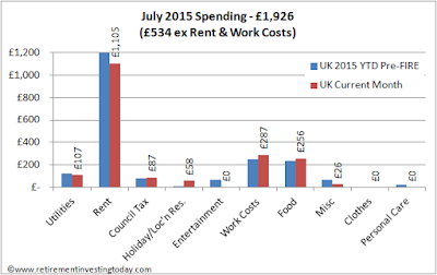
In July 2015 I spent £1,926 (an annualised £23,112) and 2015 Year to Date I've averaged £2,068 per month (£24,816 annualised).  This covers all family spending, whether for fun or just too live, plus any personal spending that I desire.  The only thing excluded is my better half’s small personal spending.  Given this is hopefully my final full year before FIRE I want to track my full 2015 average spending as well as monthly for a couple reasons:
  • It gives me a floor of spending at which the family are happy with the lifestyle that we are living.  This will help tell me when I’m FI (financial independent), which will be before FIRE’d.  It will also help me understand how much overhead my 2.5% wealth withdrawal rate, at the start of FIRE, combined with my £1,000,000, actually provides me with.
  • We are still torn between early retirement in The Mediterranean vs Old Blighty and this will also help us understand our average spending profile when in different countries.
Retirement Investing Today July 2015 and Average 2015 Spending
Click to enlarge, Retirement Investing Today July 2015 and Average 2015 Spending

Now the detail:

Saturday 8 August 2015

The Lending Works Experiment

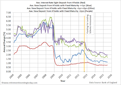
A little over a year ago I cried enough of the derisory instant savings account interest rates that were being offered by the banking sector, which after inflation and taxes, meant the value of my wealth was going backwards.  A quick trip over to Money Saving Expert reveals that the problem still exists.   The market-leading rate if you want instant access to your money is 1.6% meaning a higher rate tax punter, after inflation of 1.0%, is going backwards by 0.04% annually.  Additionally, this rate then reverts to 1.1% after a year meaning you have to do the savings account dance all again.  Even the best 3-year fixed rate account is only offering 2.65% meaning after inflation of 1.0% and higher rate tax our punter would only be getting ahead by 0.59%.  The chart below shows it’s been like this for a long time now and with no sign of an up-turn.

Average UK Savings Account Interest Rates
Click to enlarge, Average UK Savings Account Interest Rates

Meanwhile, while this has all been occurring I’ve been quietly shifting/building wealth with peer to peer (P2P) lending (while of course acknowledging that P2P has a different risk profile to bank savings accounts) as an alternative to a bank savings account.  Today I have as much money invested in P2P, £43,000, as I do in savings accounts.  Since starting out in May 2014 I’ve earned interest/bonuses of £1,342 which after taking into account deposits/transfers occurring over time is an annualised 4.3%.

Given my successes so far with P2P my interest was piqued this week when I was contacted by Lending Works enquiring whether there was any opportunity for us to work together.  At the time I wasn't using Lending Works as a P2P platform but I was aware of them as I know weenie over at Quietly Saving has money in their platform.  A few emails later we had agreed that rather than something like a boring advertisement that would add little value to readers I would instead run a published experiment with real money lent into the market.

Saturday 1 August 2015

My FIRE Number

Since starting this blog at 35 years of age in 2009 I have never revealed my portfolio values or targets in £ terms.  Rightly or wrongly I've always believed that it was irrelevant to readers given we all have different earnings, investments, risk profiles, savings rates and target retirement amounts.  This has resulted in posts that always focus on the theory and how I'm applying it but that in hindsight come across as dry and impersonal.

Today I'm going to try and change that by starting to talk in real numbers rather than percentages.  My hope is that it will up the debate a little and help us all continue to learn from each other.  I just hope it doesn't kill the community that has developed over the past 5 or so years.  Given the name of this blog and my closeness to FIRE (financially independent retired early) the amount of wealth I am trying to accrue is probably the number that is currently most important to me and probably one of the most popular topics debated/discussed within personal finance blogs and forums.  So let’s start there.

As a person who does not plan on receiving a State Pension and is not going to be receiving any sort of inheritance it is a crucial number for me as to fully FIRE it needs to be enough to last my family and I for the rest of my life.  That could be 45 or more years.  The methodology to calculate it was first devised back in 2007 when I first started on my DIY FIRE journey and went like this:
  • I was renting in London, as I still am today and though of London as home
  • I asked myself what a good salary would be that would enable me to live well including covering rent or mortgage payments.  That number was £30,000
  • As I worked towards FIRE I would increase that salary annually by inflation.  Today that salary within my Excel spreadsheet is £37,691
  • I calculated what I expected my portfolio to return annually in real terms.  This number still dynamically calculates in my Excel spreadsheet every week when I update my financial position.  That number after expenses was 3.8%.  A number I later learnt wasn't so far from the (in)famous 4% Rule
Dividing that FIRE salary by the expected return enabled me to calculate my number.  Today Excel tells me my early retirement number is £1,011,034.  To avoid discussions about me being obsessive compulsive let’s do a little rounding - I will be financially independent and have the option of early retirement with wealth of one million pounds.  My journey to the million is shown in the chart below.

Saturday 25 July 2015

The Exchange Rate Conundrum

It’s no secret that exchange rates can be and are volatile.  If you’re a person who’s earning in Pounds, has a reasonable portion of their wealth in Pounds and intends to retire in the UK spending Pounds then exchange rates are probably not going to lose you too much sleep.  Short term volatility might add a couple of hundred pounds to your continental holiday or repress the return on your international equities for a couple of years, where if you've made reasonable plans with a little contingency, is going to be noise in the scheme of things.  Long term volatility could end up resulting in some inflation but your Safe Withdrawal Rate has hopefully accounted for that as well.

Now let’s jump to somebody like myself and I'm sure I'm not along out there.  I'm earning in Pounds, have a reasonable portion of my wealth in Pounds, intend to retire early somewhere in the Mediterranean (still favouring Malta) but want to always give myself a chance of coming back to the UK if it for any reason turns ugly.  From today this is how the plans are unfolding:
1. 12 to 18 months still working for The Man in the UK and earning Pounds
2. Move to Malta (more likely Malta’s smaller island Gozo) and rent for 6 months to be sure I still love the place and know exactly which region I want to live
3. Buy a home for my family
4. Live happily ever after spending Euro’s but with my wealth still set up assuming the UK is home.  Longer term I may start to tilt more towards a European home assumption but that would be very gradual and take many years.

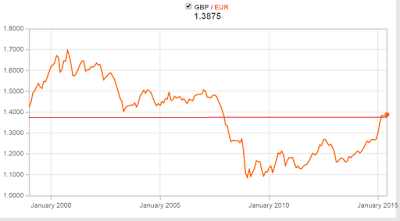
So I'm more heavily exposed to the GBP (Pounds or £’s) to EUR (Euro or €) exchange rate.  The Euro first started on the 01 January 1999 as an accounting currency and the chart below shows its monthly performance up to present day.

GBP to EUR Exchange Rate January 1999 to June 2015
Click to enlarge, GBP to EUR Exchange Rate January 1999 to June 2015 

Even over that relatively short period big swings are evident.  It was at its weakest in October 2000 at 1.6977 and strongest in January 2009 at 1.0863.  The long run average is 1.3756 (the red line on the chart) which isn't far from today’s rate of 1.41287.

Saturday 18 July 2015

A Retirement Investing Today Half 1 2015 Review

On this blog I talk a lot about my own strategy and portfolio including how I'm managing and changing them as I learn.  Importantly, this is not a demonstration strategy or portfolio but instead reflects every penny I have to my name.  The journey also now represents a significant portion of my life with me now having been on this DIY Early Financial Independence (FI) path for seven and three quarter years which is nearly 20% of my life so far.  When I started in 2007 and even when I started this blog in 2009 I had no idea if I would succeed.  Today I'm far more confident that I’ll eventually get there and I also now believe that I have a level of personal finance knowledge that will enable me to self manage my portfolio to and into Early Retirement.  Even so I’m not yet going to relax.  At some point I'm also sure I’ll need to start thinking about how to set-up an autopilot portfolio (Vanguard LifeStrategy anyone?) but that’s for another day.

This strategy and portfolio is an essential enabler to how I want to live my later life – one not burdened by the need to work for The Man but instead able to focus 100% on what’s important to me which enables both location and time freedom.  Given its importance I like to stop every quarter and in line with my Plan, Do, Check, Act (PDCA) strategy do some Checking against the three key focus areas that I believe are essential to get over the Financial Independence line - Save Hard, Invest Wisely and Retire Early.

SAVE HARD

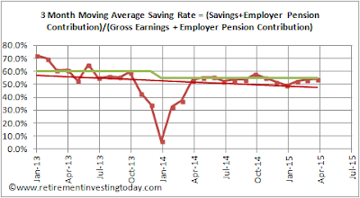
Saving Hard is defined as Gross Earnings (ie before taxes) plus Employee Pension Contributions minus Spending minus Taxes.  Earn more and one is winning.  Spend less or pay less taxes and you’re also winning.  Savings Rate is then Savings divided by Gross Earnings plus Employee Pension Contributions.  To make it a little more conservative Taxes include any taxes on investments but Earnings include no investment returns.  This encourages me to continually look for the most tax efficient investment methods.  It’s a different and tougher measure to most of my fellow personal finance bloggers who don’t include tax in the calculation.

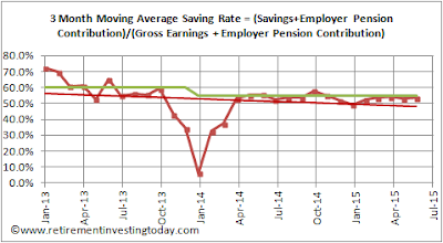
Savings Rate for the quarter ends at 53.8% against a plan of 55%.  This is identical to last quarter.  While not achieving plan in pounds, shillings and pence it’s actually 56% more than I managed in Half 1 2014 thanks in part to a healthy bonus.

RIT Savings Rate
Click to enlarge, RIT Savings Rate

Saving Hard score: Conceded Pass.  While not achieving a plan of 55% in pound terms I’m a long way above 2014.  Savings have also added 7.6% to my net wealth in the first half of the year – a surreal amount given I’m towards the back end of my Financial Independence Retire Early (FIRE) journey.

Saturday 11 July 2015

HYP Mid-Year Update including Purchase 14

The vast majority of my investment portfolio is made up of passive index tracking funds.  Why?  Well as a person who’s now been investing heavily for a bit over 7.5 years I personally believe this is the best way for me to achieve my wealth ambitions.  One exception to this is my High Yield Portfolio (HYP) which is held within the Equities portion of my portfolio and can only be described as active investing.  So if I'm a tracker believer what am I doing actively investing I hear you ask.

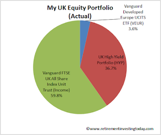
RIT UK Equities Portion of Total Portfolio
Click to enlarge, RIT UK Equities Portion of Total Portfolio 

Simply, while 99% of my investing is all about non-emotional investing my HYP is an outlier as it’s there for psychological reasons.  I’m now fast approaching optional very early retirement and when in that retirement I’m going to be likely 100% living off my wealth.  I’m going to do this by drawing down from my wealth at the rate of 2.5%.  I have two ways to do this – spend dividends/interest and/or sell down capital.  For me, particularly in a severe bear market, I think that spending dividends/interest will psychologically be far easier and less disruptive to life than being forced to sell down capital.  With that in mind before retirement I’m trying to ensure that the dividends/interest I receive annually is as close to 3% of wealth as possible.  If I can achieve 3% in the good times I can draw down 2.5% and reinvest 0.5% and in the bad times I have some buffer to allow for dividend attrition.

This psychological advantage is however a fool’s errand if it causes my total portfolio to underperform the market.  Unemotionally what matters is Total Return which is Capital Appreciation plus Dividends.  So with this in mind I watch my HYP performance, particularly capital gains, like a hawk.  So as we pass the mid-year point of 2015 let’s take a look at my HYP's performance to date.

Firstly to what the HYP is all about – Dividends.  Performance here is still very good with the portfolio currently sitting on a trailing yield of 5.2% which is 1.4 times the FTSE100’s 3.6%.  So far so good.

Now let’s look at the risk associated with buying big, boring, non-cyclical industries – Capital Gains.  Since inception in November 2011 this is also ok.  The HYP has returned a gain of 31.0% vs the FTSE100’s 25.6%.  Where it gets interesting though is year to date gains to today.  Here the HYP has fallen by 1.7% vs the FTSE100’s gain of 1.6%.

Friday 3 July 2015

A Sobering Income Drawdown Demonstration – 8.5 Years In

While my recent posts on sequence of returns risk during drawdown and bond to equity volatility vs returns are still fresh in our minds let’s return to our retiree's who are another drawdown year on having now been in wealth drawdown for 8.5 years.

For long term consistency I want to make as few changes to the original assumptions as possible however this year one change would seem prudent.  To represent the equities portion of the portfolios I use the iShares FTSE 100 UCITS ETF (ticker: ISF) as a proxy.  This year that ETF has become an iShares Core Series ETF resulting in a TER change from 0.4% to 0.07%.  I'm going to allow that change to occur within the assumptions as it simulates a real change that an investor might see.  All other assumptions are unchanged from the original post.  Re-emphasising some of the key assumptions:
  • Our retiree’s are drawing down at the stated withdrawal rate plus fund expenses only.  This means any trading commissions, wrapper fees (eg ISA, SIPP fees), buy/sell spreads and taxes have to be paid out of the earnings taken.  For example, our 2% initial withdrawal rate retiree's are actually drawing down at between 2.10% and 2.21% dependent on the asset allocation selected.
  • All calculations are in real (inflation adjusted) terms meaning that a £ in 2006 is equal to a £ today.
  • 6 Simple UK equity / UK bond portfolios are simulated for our retiree's.  The UK equities portion is always the FTSE 100 where as mentioned above the iShares FTSE 100 ETF (ISF) is used as the proxy.  For the bonds portion a simulation is run against UK gilts (FTSE Actuaries Government Securities UK Gilts All Stock Index) where the iShares FTSE UK All Stocks Gilt ETF (IGLT) is used as the proxy and the bond type I prefer in my own portfolio, UK index linked gilts (Barclays UK Government Inflation-Linked Bond Index), where the iShares Barclays £ Index-Linked Gilts ETF (INXG) is used as the proxy.
  • The wealth accrued at retirement (the 31 December 2006) is £100,000.  To simulate a larger or smaller amount of wealth just multiple by a constant. For example if you want our retiree’s to have £600,000 just multiply all the subsequent pound values by 6.

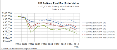
A 4% Initial Withdrawal Rate

UK Retiree Real Portfolio Value, £100,000 Initial Value, 4% Withdrawal Rate, 30 June Value
UK Retiree Real Portfolio Value, £100,000 Initial Value, 4% Withdrawal Rate, 30 June Value, Click to Enlarge

I've picked a 4% withdrawal rate because of the often quoted (dangerously in some cases IMHO but that’s for another day) 4% safe withdrawal rate rule.  The 50% equity : 50% gilts portfolios (the red lines on the chart) are the closest representations to the 4% rule with obvious differences being that:
  • the 4% rule was for a US punter with US based investments while I'm simulating UK punters with UK based investments; and
  • the 4% rule doesn't consider fees where I'm capturing the OCF's of the ETF's which makes my withdrawal rate very slightly higher.

Saturday 27 June 2015

Bond to Equity Allocation Percentages

So you’ve decided that you would like to try and gain some volatility versus return free lunch via some Bonds mixed in with your Equities or Equities mixed in with your Bonds.  The next million dollar question to answer is then how much of your wealth should be allocated to each asset class.  This is a critical question as it will likely have a big affect on your long term portfolio return.

Unfortunately, as with many investing questions, I'm yet to find a silver bullet but considerations will certainly include your tolerance to volatility and risk.  Assessing this tolerance is of course easier said than done.  For example if you’re naturally risk averse you might choose to load up with more bonds as history suggests they might dampen volatility at the expense of some return however this adds absolutely no value if you then have a low probability of  ever achieving your long term goal.  Conversely there is then no point loading up with more equities to then sell at the first significant equity downturn.  On top of this there could also be age considerations.  For example every year that passes gives you less time to rebuild wealth before retirement.

So what do others have to say about bond to equity allocation percentages?

The granddaddy of value investing, Benjamin Graham, in his excellent first published in 1949 revised multiple times book, The Intelligent Investor, says “We have already outlined in briefest form the portfolio policy of the defensive investor.  He should divide his funds between high-grade bonds and high-grade common stocks.  We have suggested as a fundamental guiding rule that the investor should never have less than 25% or more than 75% of his funds in common stocks, with a consequent inverse range of between 75% and 25% in bonds.  There is an implication here that the standard division should be an equal one, or 50-50, between the two major investment mediums.  According to tradition the sound reason for increasing the percentage in common stocks would be the appearance of the “bargain price” levels created in a protracted bear market.  Conversely, sound procedure would call for reducing the common-stock component below 50% when in the judgement of the investor the market has become dangerously high.”

Friday 19 June 2015

Why I Hold Bonds in My Portfolio

I don’t think it’s too controversial to suggest, that at its simplest, a modern portfolio will contain bonds (whether government and/or corporate, domestic and/or international, index linked and/or otherwise) and equities (whether domestic, international developed and/or emerging).  I make this statement as bonds and equities are two asset classes that historically have exhibited different properties that when combined can work together to give some interesting characteristics.  Tim Hale describes the differences well – “Equities have an economic rationale for and history of delivering mid-digit real returns (after inflation) and are considered the engines of portfolio returns, but with considerable and sometimes extremes swings in returns...  High quality domestic bonds on the other hand, tend to have far smoother return patterns at a cost of lower returns, which come in the low single digits, after inflation.”

I probably make it more complicated than it needs to be but at its heart my portfolio is not much more than a 32% bonds/68% equities portfolio which at its conclusion will likely settle at a 40% bonds/60% equities portfolio.  In comparison I’ve recently starting noticing more and more personal finance bloggers who are holding far lower or even no bond allocations in their portfolios.  This has had me thinking:
  1. has the significance of bonds in a portfolio disappeared;
  2. is it correlated to us now having been in a bull market since 2009;
  3. is it because my high savings rate encourages and allows me to live the Warren Buffet quote “Rule No. 1: Never lose money.  Rule No. 2: Never forget rule No. 1” where others might be chasing higher yields; or
  4. is it just simply that I’m now nearing the end of my rapid wealth generating journey and others are a little earlier on in theirs.

To make sure it’s not number 1 let’s spend some time going back to fundamentals to understand if bonds combined with equities are still doing their thing.  I’ve been able to source 10 full calendar years (not quite for the bonds as I’ve only been able to go back to 29 March 2004 but close enough) of total return bond and equity performance covering the years 2004 to 2014.  The bonds are the Markit iBoxx GBP Liquid Corporates Large Cap Index and the equities are the FTSE 100.  Armed with this information I can calculate the annual return possible for everything from 100% bonds, through various mixed bond/equity allocations to 100% equities for each year.  I can then calculate the volatility (I’ve used standard deviation to represent volatility) for each allocation for the 10year period.  The 100% Bonds portfolio has volatility of 7.2%, the 40% Bonds/60% Equities has 10.7% while the 100% Equities has 14.8%.  This is all shown in my first table below.

Portfolio Annual Return if Bonds/Equities Allocation Rebalanced at Start of each Year
Click to enlarge, Portfolio Annual Return if Bonds/Equities Allocation Rebalanced at Start of each Year

Saturday 13 June 2015

Adding Legal & General to my High Dividend Yield Portfolio (HYP)

On the 29 May 2015 I added Legal & General (LGEN) to my High Yield Portfolio (HYP) at a price of £2.6766 a share.  Since purchase they've fallen a little in Price closing at £2.639 on Friday.  LGEN represents my 13th formal HYP purchase and brings my total HYP portfolio to 15 shares if I include the government gift that was Royal Mail Group (RMG) and the demerger of South32 from BHP Billiton (BLT).

Having unitised my HYP I can accurately tell you that since inception in November 2011 my HYP has seen capital gains of 34.2% compared to the FTSE 100 at 27.7%.  Year to date capital gains performance switches with the HYP up only 0.6% compared with the FTSE 100 at 3.3%.  Dividend yields however, which is why I have the HYP in the first place, are 5.1% (trailing yields) for the HYP vs only 3.6% for the FTSE 100.

So why did I buy Legal & General?  Within my HYP I’m looking to buy solid companies that currently have high yields but which I hope to be able to hold for the very long term, ideally the rest of my life.  Some of the key criteria for me were:
  • The Legal & General business model is easy to understand.  They are a large insurance and investment management group with their fingers in defined benefit pensions, annuities, fund management, life insurance and fund wrapper (cofunds for example) pies.
  • I prefer large and non-cyclical industries.  Its company number 35 in the FTSE 100 with a market capitalisation of £15.8 billion and generates £1.3 billion in revenues.  It is however not a non-cyclical company.  To demonstrate in 2007 they had an adjusted earnings per share of £0.1188 which by 2008 had turned into -£0.1788.  This then also forced a dividend cut in 2008 and a further cut in 2009 which didn’t recover to 2007 levels until 2011.  So as a retiree living off LGEN dividends your ‘salary’ would have fallen by 1/3 which is not insignificant.
  • To minimise risk I'm looking for my HYP shares to be spread over a number of sectors.  LGEN adds a new sector for me – Life Insurance.
  • I’m looking for shares with dividend yields somewhere between the current FTSE 100 yield of 3.6% and 1.5 times the FTSE 100 yield or 5.4%.  On a trailing yield of 4.3% LGEN is right in the sweet spot.  Forecast dividend yield is near the top end at 5.0%.
  • The company should have an unbroken history of continually increasing dividends plus dividends that increase at a rate equal to or greater than inflation.  As already mentioned they’ve had their transgression but in the 5 years to 2014 LGEN have raised their dividends from £0.0384 per share to £0.1125 or 193% which is a country mile above inflation over the same 5 years at 18%.  Taking away the flattery that the transgression provides and dividends are also up 88% since 2007.  This nicely demonstrates why it might be prudent to carry a couple of years of cash buffer in retirement as the last thing you want to be doing is selling capital to eat when prices are severely depressed.
  • A dividend cover of greater than 1.5 for all HYP type shares except utilities where I think that greater than 1.25 is ok.  Here LGEN is right on the limit at 1.5.
  • ‘Creative accounting’ can make earnings and hence dividend cover look good.  I therefore also set a greater than or equal to 2 criteria on Operating Cash Flows compared to Dividends.  At 8.3 this is very high but for LGEN this metric moves around a lot.  In 2013 it was 2.4.
  • Valuations don’t look cheap with a P/E ratio of 15.8 and a Price/Book ratio of 2.5.
  • As I write this post today I have 83.2% of the investment wealth that I believe I need to bring me financial independence.  What I find interesting is that I don’t have a single £ anywhere near a LGEN product.  I'm not sure if this is a good thing or a bad thing though...

Saturday 6 June 2015

My Investment Portfolio Warts and All

Two events have occurred in the past week that prompt this post:
  1. My Defined Contribution Company Pension transfer to a Hargreaves Lansdown SIPP has now completed.  The timings ended up being that I sent all the paperwork to Hargreaves Lansdown on the 09 May ’15, received a confirmation letter that it was in progress on the 13 May, the cash landed in my new Hargreaves Lansdown SIPP on the 29 May, I bought all my new low expense investment products (which made this post a little redundant) on the 01 June and the £500 cash back offer landed in my account on the 05 June.  So all in about a month for it all to wash through.  Total Investment Portfolio expenses including SIPP wrapper charges now run to 0.28% per annum.
  2. I received a Facebook message from a reader asking if I could do a post with “a really detailed breakdown of my portfolio starting with a rough pie chart with just equities, bond, gold, alternative investments, property etc and then a more detailed breakdown again perhaps an exploded pie chart of the main parts. For example share category American, European shares etc.”  When I read the message I realised that while I've talked ad infinitum about my portfolio over the years I've never given such a detailed breakdown including investment product percentages.
So without further ado here’s my investment portfolio warts and all.

The investment strategy (some might call it an Investment Policy Statement) on which my portfolio is based has now been in place almost since the beginning of my journey.  I first documented it in 2009 but I would suggest reading my 2012 strategy summary (as it included the addition of my High Yield Portfolio (HYP) for a portion of my UK Equities) in parallel to today’s post.  The strategy post will give you the “Why” behind my thinking while today’s post will give you the “What”.  It’s also important to note that nothing I do is original or clever.  It’s predominantly based on work by Tim Hale which is a book that I believe every UK investor should read with tweaks coming from the reading of the following books.

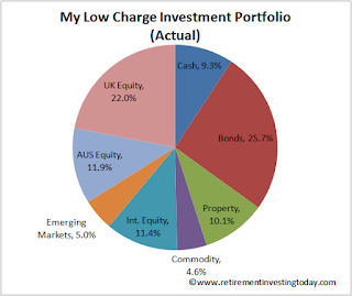
The Top Level Investment Portfolio

My Actual Low Charge Investment Portfolio
Click to enlarge, My Actual Low Charge Investment Portfolio

At a top level the portfolio contains local and International Equities, Commodities, Property, Bonds and Cash.

Saturday 30 May 2015

Insuring Against Sequence of Returns Risk with the State Pension

Anybody who is intending to retire (particularly those taking early retirement) without a healthy Defined Benefit Pension or without knowledge of a guaranteed healthy inheritance should be wary of and maybe even have a healthy fear of sequence of returns risk.  It is the risk of receiving a series of investment returns that are negative (or lower) during a period when you are in portfolio/wealth drawdown which then never allows your wealth to recover even when investment returns normalise.

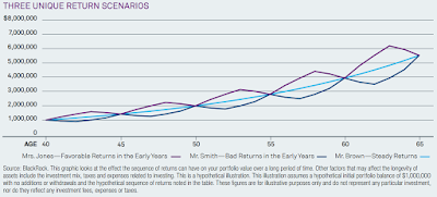
Blackrock have a couple of charts which demonstrate the phenomena nicely.  Firstly, let’s look at Sequence of Returns during the Wealth Accrual Phase (ie before Retirement).  The chart below shows 3 investors who each make an initial investment of $1,000,000 at age 40 and then never invest again.  Each has an average annual return of 7% but each experiences a different sequence of returns.  25 years later each has the same portfolio value even though valuations varied along the way.

Sequence of Returns during Wealth Accrual Phase
Click to enlarge, Sequence of Returns during Wealth Accrual Phase

Now let’s look at Sequence of Returns during the Wealth Drawdown phase.  Again we have our 3 investors making the same initial $1,000,000 investment, the same average annual return of 7% with annual returns following the same sequences as during the Wealth Accrual Phase.  25 years later each have very different portfolio values with Mr White now forced to beg for food under a bridge.

Saturday 23 May 2015

Valuing the UK Equities Market (FTSE 100) - May 2015

My investment strategy requires me to moderate my equity holdings based upon my view of current equity market values.  I run this valuation monthly for the Australian (currently targeting 15.5% of total portfolio value at current valuation vs 17% at fair value), US (as a proxy for my international equities and currently targeting 10.4% vs 15%) and UK (currently targeting 19.0% vs 20%) Equity markets.  Let’s look at the UK Equity market in more detail.

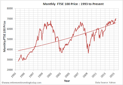
Firstly nominal values.  Between yesterday and the 1st April 2015 (“month on month”) prices are up 3.3% and since the 1st May 2014 (“year on year”) prices are also up 3.3%.

Chart of the FTSE 100 Price
Chart of the FTSE 100 Price, Click to enlarge

Regular readers will know I’m not a fan of this type of chart as:
  • the unit of measure, £’s, is being constantly devalued through inflation (although in the current market one wonders for how much longer); plus
  • Pricing should be plotted on a logarithmic scale as opposed to a linear one as by using this scale percentage changes in Price appear the same.  

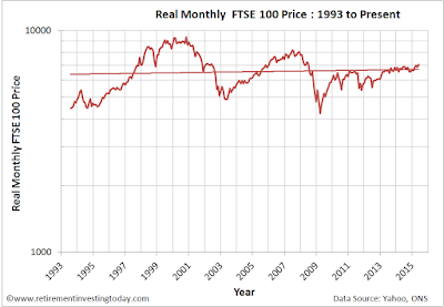
So let’s correct the chart for the devaluation of the £ through inflation (I use the Consumer Price Index (CPI) here) and convert to a log chart.  This normalised chart shows that Friday’s FTSE 100 Price of 7,031 is actually still 25% below the Real high of 9,331 seen in October 2000.  We’re also still 14% below the last Real cycle high of 8,164 seen in June 2007.

Chart of the Real FTSE100 Price
Chart of the Real FTSE100 Price, Click to enlarge

Saturday 16 May 2015

Life’s Great Saving Hard and Investing Wisely for Early Retirement

This week as I was thumping up and down the motorway on my lengthy daily commutes I couldn’t help but take some glimpses of the current and potential future life that this journey to Early Financial Independence is providing.  There are of course negatives but the positives really did override my thoughts.  Let me share a few random musings.

Saving Hard

In a post back in March I shared a little about my personal life which included my ‘9 to 5’.  Today is my 397th post on Retirement Investing Today and that post is right up there when it came to Comments at 51 to date.  Some of them pointed to a punishing work life which prompted me to look around at my colleagues and I do agree that I work much harder than most but this is a little by design as I always want to stay in the top 10% of my peer group.  The rub is that what seems a negative to some is now just normal and on autopilot to me plus on the whole my health and wellbeing is as good as it has ever been.  The positive though is that this approach allows things like earnings increases of 44% in a year and I can already see a door potentially opening that may allow another step change in earnings.  So while I admit to being tired come Friday night I also think my colleagues probably are as well.  The difference is that I have an extra chunk of cash which I can save to power me towards Financial Independence Retire Early (FIRE) which means I’ll be done in the not too distant future and they’ll retire when the government lets them.

On the spending front I've also realised that Living Well Below My Means is now just an autopilot activity.  I no longer crave stuff and get zero satisfaction from consumerism.  I do still track spending religiously just in case I need to correct course but I no longer have any sort of budget and certainly don’t have a £0 one.

These two mind sets currently allow me to save 54% of gross earnings.  Sure it’s not at my target of 55% but do you know what – I really am starting to not care anymore.

Gross Savings Rate
Click to enlarge, Gross Savings Rate

Investing Wisely

My investment portfolio which is largely just a set of diversified tracker funds is running pretty close to plan through nothing more than passive portfolio rebalancing and to the end of April 2015 has grown by a Real (after inflation) Compound Annual Growth Rate after expenses of 4% since inception.  It’s also now pretty close to being an autopilot activity.

Performance of £10,000 within RIT Portfolio and Benchmark vs Inflation
Click to enlarge, Performance of £10,000 within RIT Portfolio and Benchmark vs Inflation

One active element with my investment portfolio is of course my High Yield Portfolio (HYP).  Trailing dividend yield is a healthy 5.0% when compared to the FTSE100 at 3.5%.  Capital Gain since inception is also a healthy 38% vs 31% for the FTSE100.  Over the shorter term it’s not so rosy with Capital Gain year to date at 3.5% vs 6.0% for the FTSE100.  So this non passive piece is not quite on autopilot but the strategy is well defined and I'm still happy with the results.  The question I'm starting to ask myself though is can I really be bothered with it.  I'm going to watch it for a year or two more but if results do start to converge toward the index I may just go passive.

Saturday 9 May 2015

Valuing the Housing of England and Wales at County Level – Year 3

Every year in May I like to spend a few hours of my life that I’ll never get back preparing a house Valuation metric that goes beyond that generally presented by the mainstream media by getting more granular and trying to Value housing at County level.  This should then for example help us to understand if there really is a north south divide when it comes to housing.  Last year’s efforts can be seen here.

My definition of Value is simply how many years of gross earnings (median and average) are required to buy an average house.  This is a simple average Price to Earnings Ratio (P/E) and is not unlike how some might value a company share.  Importantly I am not interested in Affordability which is one’s ability to service debt at current interest rates and is what I think actually drives the UK housing market.  This is because I believe that the average punter doesn’t ask is this house good Value but instead asks how much can I borrow and then spends to that limit.

For House Prices I am using average house prices as published by the Land Registry. This is calculated by using:
  • The Land Registry House Price Index (HPI) dataset.  This index uses repeat sales regression (RSR) on houses which have been sold more than once to calculate an increase or decrease.  As it analyses each house and compares the latest buying price to the previous buying price it is by definition mix adjusting its data also.  It uses all residential property transactions made in England and Wales since January 1995 so covers buyers using both cash and mortgages.
  • Average prices are then calculated by taking Geometric Mean Prices (as opposed to an arithmetic mean), to reduce the influence of individual values, from April 2000 and adjusting these prices in accordance with the Index changes.  They are seasonally adjusted. I am using the latest published data which comes from March 2015.  

The Valuation analysis is arranged according to the Regions and County’s defined by the Land Registry and is shown in the Table below.  Unlike the mainstream media I am calling high house prices bad (unsurprisingly the County with the highest house price is London at £462,799 and is shown in dark red) and low house prices good (the County with the lowest house price is Middlesbrough at £62,546 and is dark green) with all other prices shaded between red and green depending on house price.

For Earnings I am using the 2014 Annual Survey of Hours and Earnings (ASHE) which provides information about the levels, distribution and make-up of earnings and hours paid for employees within industries, occupations and regions in the UK.  To ensure that our Earners and Homes are located within the same County I’m using the Earnings by Place of Residence by Local Authority.  This dataset presents weekly Earnings at both median (the middle point from each distribution) and mean (the average) levels which we have arranged into each Land Registry Region and County in the Table below.  I then multiply the data by 52 weeks to convert it to an annual salary.  I am calling low earnings bad (the lowest average earnings are £17,638 in Blackpool and are dark red) and high earnings good (the highest average earnings are £36,982 in Windsor and Maidenhead and are dark green) with all other earnings shaded between red and green depending on earnings.

Monday 4 May 2015

Transferring my Company Pension into a SIPP – Part 2

Hargreaves Lansdown Logo
On Saturday the SIPP of choice for my Company Pension transfer was heading towards Interactive Investor and their annual costs of £176.  Valued reader comments plus some more DYOR has instead led me to Hargreaves Lansdown.  Before you Comment that they are an expensive percentage fee broker/platform with annual charges of 0.45% let’s run through my thinking.

Firstly, dearieme highlighted that provided you stick with Shares, investment trusts, ETFs,
gilts & bonds and don’t add any funds Hargreaves Lansdown become a percentage fee broker/platform but with a capped maximum annual expense of £200.  I can work within that no fund criteria.  So now once your pension is greater than £44,444 that 0.45% starts to reduce.  Transfer £100,000 and it’s down to 0.2%.  On top of that John and Cerridwen also raised some red flags against Interactive Investor.

Secondly, even though the SIPP is now capped I hear you saying that it’s still £24 a year more expensive than Interactive Investor and sweating the small stuff matters.  This is where it gets interesting.  Hargreaves Lansdown currently have a promotion running until the 12 May 2015 that provides a cash back incentive for transfers of Stocks & Shares ISA’s, Cash ISA’s, Junior ISAs/Child Trust Funds (CTFs), Funds, Shares and Pensions.  They also advise that “if you need more time to decide please let us know and we will extend this deadline for you (up to three months for ISA, fund and share transfers, and six months for pensions).”  Transfer big sums and it’s a significant amount.  Between £100,000 and £124,999 and its £250 cash back which means you’re now ahead of Interactive Investor’s current annual charges for 10 years.  Transfer £125,000 or more and its £500 which puts you ahead for 20 years.  Dealing costs for me are going to also be £1.95 more expensive than Interactive Investor but I think I can set the SIPP up with 9 trades which would take a bit under 1 year off that benefit.

I highlighted in Saturday’s post that the reason for not just using my current YouInvest SIPP was the all eggs in one basket risk.  I currently have some of my HYP in a Hargreaves Lansdown Vantage Fund & Share Account and so adding a Hargreaves Lansdown SIPP will increase my exposure with this provider from 6% to 21%.  I’m ok with that level of risk.

So by switching from Interactive Investor to Hargreaves Lansdown I can save some money while also moving to a wrapper that I know and am happy with while keeping provider risk to acceptable levels.