Sunday 2 June 2013

I’m Buying Gold (Gold Priced in British Pounds – May 2013 Update)

Gold when priced in USD’s closed on Friday at a nominal $1,388.30.  Convert that into GBP’s and you’re looking at a Nominal Gold Price of £912.53.  Staying in Sterling that is a Nominal Gold month on month price fall of 5.9% and a year on year price fall of 8.4%.  The chart below shows the Nominal Monthly Gold Price in £’s since 1979.

Monthly Gold Prices in £’s
Click to enlarge

If we then adjust this Gold chart for the continual devaluation of Sterling through inflation we can see Real Gold Prices which are shown in the chart below.  If this is of particular interest then you might also be interested in understanding if Gold can protect UK Investors from inflation.   The key Real Monthly Gold Price metrics are:

  • Real Gold Peak Price was £1,199.2 in January 1980.  At £912.53 we are 23.9% below that peak today.
  • The long run average is £542.96 which is therefore still indicating a very large potential overvaluation.
  • The trendline indicates the Real Gold Price should today be £506.36 which would indicate even further overvaluation.  

Real Monthly Gold Prices in £’s
Click to enlarge

I aim to hold Gold within my own Low Charge Portfolio.  This isn't because I wear a tin foil hat or think that the world is about to go all Mad Max.  It’s because I want to hold commodities within my portfolio as they have a different correlation with my other asset classes and Gold (unlike many commodities for investors) if bought correctly is one commodity that won’t suffer from contango or backwardation.

Sunday 26 May 2013

Valuing London Property at Borough Level

The mainstream media usually report UK House Prices at a national level.  Recently we went one level deeper by examining English and Welsh property at County Level however this data left an elephant in the room.  That elephant was London, a small village located in the South East of England with a population of 8.2 million, and one which was included as a single data point.  Today let’s go deeper into London and look at the Salaries, House Prices and Value of each London Borough.

To Value the London market by borough we will maintain consistency with our previous definition which is a simple Price to Earnings Ratio (P/E).  As with the County level analysis we will use the Land Registry House Price Index for prices.  We’ll stay with calling high house prices bad (the Borough with the highest average house price, unsurprisingly, is Kensington & Chelsea at £1,104,770 and is shown in dark red) and low house prices good (the Borough with the lowest house price is Barking & Dagenham at £213,581 and is dark green) with all other prices shaded between red and green depending on house price.  What I find amazing is that Barking & Dagenham, the cheapest Borough, is still 32% more expensive than the England and Wales average.

For Earnings we’ll also stay with the 2012 Annual Survey of Hours and Earnings (ASHE) which provides information about the levels, distribution and make-up of earnings and hours paid for employees within industries, occupations and regions in the UK.  To ensure that our Earners and Houses are located within the same Borough we’ll use the Earnings by Place of Residence by Local Authority.  We again multiply the data by 52 weeks to convert it to an annual salary.  We stay with calling low earnings bad (the lowest average earnings are £19,183 in Newham which surprisingly is only 8% higher than the lowest County which was Blackpool and is shown in dark red) and high earnings good (the highest average earnings are £59,441 in Kensington and Chelsea and is dark green) with all other earnings shaded between red and green depending on earnings.

Thursday 23 May 2013

Is it Time to Buy a Home


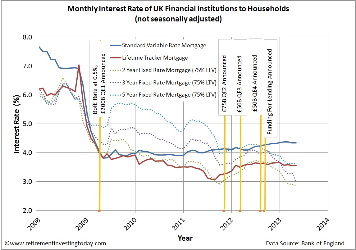
On the 24th of April 2013 the Bank of England and HM Treasury announced that the Funding for Lending Scheme (FLS) would be extended until January 2015.  It was also modified to include selected non-bank providers of credit to the UK economy.  Between the FLS Scheme, a Bank of England Bank Rate of 0.5% and £375 billion of Quantitative Easing mortgage rates have fallen a long way.  Let’s look at the data.

The Bank of England publishes a number of datasets on this topic and I have picked 5 which cover the more common mortgage types available today.  They are the sterling monthly mortgage interest rate of UK monetary financial institutions (excluding Central Bank) covering:

  • Standard Variable Rate (SVR) mortgages.  These were starting to rise at glacial speeds but have now pulled back a little.  Today they sit at 4.34%, flat month on month and up 0.24% year on year. 
  • Lifetime Tracker mortgages.  These have been flat for some time now.  Currently they are 3.56% which is flat on the month and sees a decrease of 0.04% on the year.
  • 2, 3 and 5 Year Fixed Rate Mortgages with a 75% loan to value ratio (LTV) continue the falls that appear to have accelerated in a downwards direction at the same time the original FLS was announced.  Today we see these mortgages at 2.87% (down 0.04% on the month, 0.79% on the year), 2.98% (down 0.32% on the month, 1.05% on the year) and 3.61% (down 0.02% on the month, 0.68% on the year) respectively.  Since the FLS scheme started the falls are 0.82%, 1.03% and 0.50% respectively.

A history of these mortgage rates can be seen in the chart below which also shows the announcement dates of the Bank of England Bank Rate of 0.5%, 4 tranches of Quantitative Easing and Funding for Lending.

UK Standard Variable Rate Mortgages, Lifetime Tracker Mortgages and Fixed Rate Mortgages
Click to enlarge 

With inflation currently running at 2.9% you can now get an average real inflation adjusted 2 year fixed mortgage for -0.02%, a 3 year for 0.09% and a 5 year for 0.72%.

I’m currently out of the UK property market in rental accommodation but with my Assured Shorthold Tenancy coming up for renewal in the near future plus a Letting Agent that treats me slightly worse than belly button lint every time the annual negotiation begins, it’s time to reassess whether it’s time to buy.  Today is not meant to be a comprehensive piece of data analysis in typical Retirement Investing Today style, that will probably come later as I formulate my thoughts, but more some musings of what is currently running through my mind in the hope of generating some comment from you the valued reader.

Monday 20 May 2013

Save Hard by Earning More


To gain financial independence or early retirement in the soonest possible time then Saving Hard and Investing Wisely are must do’s.  On the Saving Hard front there are two main routes that we can follow with early retirement coming sooner if both are applied with vigour.  The first is what we talk about regularly including frugal living, opting out of consumerism and watching the small spends because they can quickly add up to big spends to name but three.  This is nothing more than cutting our costs to free up cash for Investing Wisely and is something we can all do by refusing to act like a victim and then simply applying some discipline.

The second is potentially a little more difficult to achieve but equally valid and involves Earning More while increasing your costs to earn that extra by as little as possible.  There are many ways to do this but some options might include maximising your current career to gain promotion, retraining into a new career, taking whatever overtime is offered (if you are lucky enough to be offered overtime), starting a small business, developing a side income or simply starting to sell some of that consumerist tat that you bought before it becomes worthless.

Personally, up until now I've followed the maximise my career to gain promotion option but am starting to now consider some of the other options as financial independence approaches.  Some of the techniques I’ve used to get to my current position have included:

  • Looking around and ensuring I have stayed in the top 10% of my peers in terms of delivery.  Where I'm a little slower than others on some tasks it’s meant I have to work a bit longer and where I’m not as smart as someone else it’s meant some self learning or further education.  Both ways have meant more hours invested in my career than most of my peers.
  • I've never asked for a pay rise for something I am about to do unless it is of course offered.  Instead I always do the job and then ask for the pay rise.  The advantage of this method is that if they then say no I already have the skills on the CV to move to another organisation where they will recognise and pay for these new skills.
  • I'm prepared to commute to maximise earnings.  This one is a little controversial but I look at it from the perspective of maximising my free cash after all costs which includes commuting costs.  More free cash means more savings.
  • I'm very flexible.  If the toilet needs cleaning to ensure that project succeeds then I clean the toilet.
  • I'm always on the lookout for that door that is partially open even if it means a bit of extra effort in the short term.  This is because you never know where it leaves and on at least 2 occasions it has led to more stable earnings for me.


Sunday 12 May 2013

Valuing the Property of England and Wales at County Level


When we, or indeed many websites, look at what is generally called UK House Prices, House Value or House Affordability it tends to be at a high level covering either the whole United Kingdom or England and Wales.  This is fine if you are looking for macro trends but doesn't give us much of a view at what is happening locally.

Given that we are hearing a lot about the North to South divide or even the London to rest of the UK divide let’s therefore deviate from that traditional macro view and get a bit more local by calculating House Value down to a County level.

To Value the market we are going to stick with our previous definition which is a simple Price to Earnings Ratio (P/E).  Regular readers will know that for Price we normally use Nominal House Prices as published by the Nationwide and for Earnings the Office for National Statistics KAB9 Nominal Earnings which are both published monthly.  Unfortunately these aren't available down to County level and so we need to introduce two new datasets.

For House Prices we will use the Land Registry House Price Index.  As a reminder this index uses repeat sales regression on houses which have been sold more than once to calculate an increase or decrease.  As it analyses each house and compares the latest buying price to the previous buying price it is by definition mix adjusting its data also.  This is then combined with a Geometric Mean price which was taken in April 2000 to calculate the index.  It is seasonally adjusted and covers properties from England and Wales.  It covers buyers using both cash and mortgages.  We are using the latest published data which comes from March 2013.  The analysis is arranged according to the Regions and County’s defined by the Land Registry and is shown in the Table below.  Unlike the mainstream media we are going to call high house prices bad (the County with the highest house price is London at £374,568 and is shown in dark red) and low house prices good (the County with the lowest house price is Merthyr Tydfil at £66,511 and is dark green) with all other prices shaded between red and green depending on house price.

For Earnings we are using the Annual Survey of Hours and Earnings (ASHE) which provides information about the levels, distribution and make-up of earnings and hours paid for employees within industries, occupations and regions in the UK.  Unfortunately, as the name implies, it is only published annually and so we will use the 2012 dataset.  To ensure that our Earners and Houses are located within the same County we’ll use the Earnings by Place of Residence by Local Authority.  This dataset presents weekly Earnings at both median (the middle point from each distribution) and mean (the average) levels which we have arranged into each Land Registry Region and County in the Table below.  We then multiply the data by 52 weeks to convert it to an annual salary.  We are calling low earnings bad (the lowest average earnings are £17,794 in Blackpool and are dark red) and high earnings good (the highest average earnings are £40,466 in Windsor and Maidenhead and are dark green) with all other earnings shaded between red and green depending on earnings.