Thursday 20 December 2012

The FTSE 100 Cyclically Adjusted PE Ratio (FTSE 100 CAPE or PE10) – December 2012 Update

This is the Retirement Investing Today monthly update for the FTSE 100 Cyclically Adjusted PE (FTSE 100 CAPE).  Last month’s update can be found here.

As always before we look at the CAPE let us first look at other key FTSE 100 metrics:
  • The FTSE 100 mid market Price is currently 5,960 which is a gain of 1.7% on the 01 November 2012 Price of 5,862 and 8.6% above the 01 December 2011 Price of 5,489.
  • The FTSE 100 Dividend Yield is currently 3.73% which is flat against the 01 November 2012 yield of 3.71%.
  • The FTSE 100 Price to Earnings (P/E) Ratio is currently 11.46.
  • The Price and the P/E Ratio allows us to calculate the FTSE 100 As Reported Earnings (which are the last reported year’s earnings and are made up of the sum of the latest two half years earnings) as 520.  They are up 1.2% month on month and down 7.1% year on year.  The Earnings Yield is therefore 8.7%.

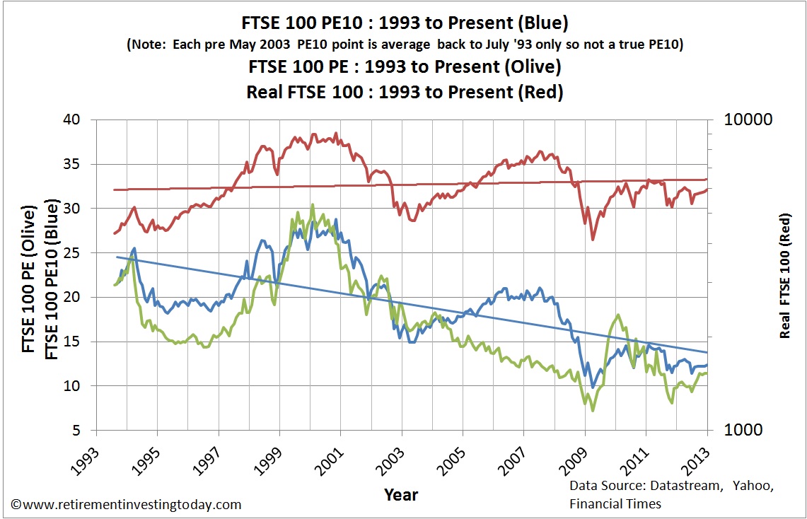
The first chart below provides a historic view of the Real (CPI adjusted) FTSE 100 Price and the Real FTSE 100 P/E.  The second chart provides a historic view of the Real Earnings along with a rolling Real 10 Year Earnings Average for the FTSE 100.

FTSE100 PE10, FTSE100 P/E Ratio and FTSE100 Real Price
Click to enlarge

FTSE100 Real Earnings
Click to enlarge

Saturday 15 December 2012

Save Hard, Invest Wisely, Retire Early

In some of my posts I feel like I’m only one step away from preaching. This is not what the site is all about. Instead I’m trying to sow some seeds which give enough information to encourage readers to go off, do their own research and make some of their own decisions away from the so many vested interests that want your money today. Today I’d like to run a case study on myself to see if I’m practicing what I “preach” and whether the seeds I’ve sown are actually growing.

I’m going to break this down into 3 sections which broadly cover everything that this site is about – Save Hard, Invest Wisely, Retire Early. Before we go there let us first set the scene. I graduate in 1995 with precisely £0 worth of assets. I start living my life like most others – get a job, start consuming, get myself into debt with a car, then get myself into debt with a house and finally save a few percent with the scraps that are leftover both personally and through an employer defined contribution pension. 2007 comes around quickly and I have one of those light bulb moments. While preparing some financial documents I actually calculate how much I’ve earned over those 12 years and looked at how much I had to show for it. It was a scary moment where I realised something had to change.

Not realising I was probably no different to 99% of the population I immediately assumed I was well behind the curve. I thought if I was to catch up I needed some professional help and so I visited a few Independent Financial Advisor’s (IFA) with a view to picking one to help me. After the meetings I sat down and thought a little about what I’d just been through. It all sounded so impressive and clever but working through each point in turn made me feel that they were deliberately trying to make it sound complicated. It was also at about the same time that I saw the book Where Are the Customers' Yachts? I made a decision. I was going to take responsibility for my own actions and control my own destiny. If it worked I could proudly say I’d done it and if it didn’t then I only had myself to blame. 2008 was then the year where I developed the strategy that you largely see me using today. I made some mistakes but it was largely positive. Then in 2009 this site was launched and I’ve been staying the course ever since. So what is that course? Let’s visit those 6 words again - Save Hard, Invest Wisely, Retire Early.

Thursday 13 December 2012

The S&P 500 Cyclically Adjusted PE (aka S&P 500 or Shiller PE10 or CAPE) – December 2012 Update

This is the Retirement Investing Today monthly update for the S&P500 Cyclically Adjusted PE (S&P 500 CAPE).  Last month’s update can be found here.

As usual before we look at the CAPE let us first look at other key S&P 500 metrics:
  • The S&P 500 Price is currently 1,417 which is a rise of 1.6% on last month’s Price of 1,395 and 14.0% above this time last year’s monthly Price of 1,243.
  • The S&P 500 Dividend Yield is currently 2.1%.
  • The S&P As Reported Earnings (using a combination of actual and estimated earnings) are currently $87.77 for an Earnings Yield of 6.2%.
  • The S&P 500 P/E Ratio is currently 16.1 which is down from last month’s 16.0.
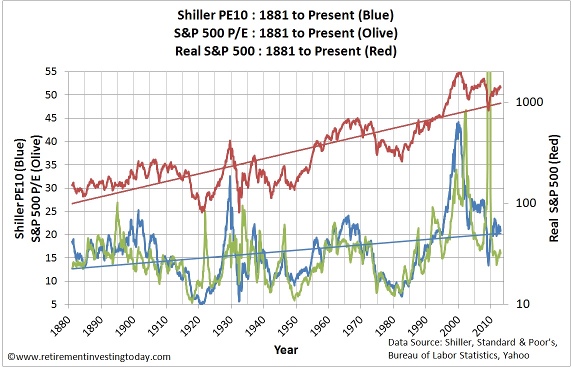
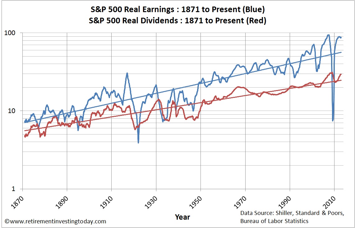
The first chart below provides a historic view of the Real (inflation adjusted) S&P 500 Price and the S&P 500 P/E.  The second chart below provides a historic view of the Real (after inflation) Earnings and Real (after inflation) Dividends for the S&P 500.

S&P500 Real Price, S&P500 P/E and S&P500 PE10 (CAPE)
Click to enlarge

S&P500 Real Earnings and S&P500 Real Dividends
Click to enlarge

Sunday 9 December 2012

Comparing UK House Prices – December 2012 Update

There are a multitude of UK House Price Indices out there.  The last time we looked at the more common ones was here.  Following some more data analysis work this month I feel as though we now have enough data and understanding to make this a regular feature.  The best starting point is to firstly move away from the popular indices and get a visual look at the raw data as a picture tells a thousand words.  The data is the actual sales of property in England and Wales for the month of October 2012 and comes courtesy of the Land Registry.  I plot this data (shown in blue) as a histogram below.  To help you see the changes that have occurred over the last month I also show last month’s data in red.  


Click to enlarge

The distortions caused by the government in the form of Stamp Duty Land Tax (SDLT) thresholds continue to be clearly visible at £125,000, £250,000 and £500,000.  The other key observation is that the number of registered sales has risen from 64,173 in September to 74,934 in October.  Note that the right hand bar is all house sales that are of a value greater than £600,000.

Thursday 6 December 2012

Australian Property Price to Income Ratios*

Looking at real estate price to income ratios can give a good indicator about whether or not now is a good time to buy property in Australia. Although housing prices have remained high throughout the past decade despite a global economic downturn, have incomes followed suit? In looking at prices from 2010-2011, home prices fell slightly while incomes have risen. According to a 2011 press release from realestate.com.au, mortgage payments comprised 34% of average household income in 2010, but this number declined to 32% in 2011. This has made housing slightly more affordable across the nation.

Fluctuations in Price to Earnings Ratios

Interest rates play a role in the affordability of Australian housing, and can experience a variety of ups and downs over the span of a 30-year loan. This is important to remember when you're deciding whether or not to invest. The ratio of house prices to household earnings has increased 2.5 times since 1970, with the biggest increase seen in the early 2000s. The ratio doubled during that period, even with more houses having two income earners. According to figures published by The Motley Fool, the average first home loan has gone up from $75,000 20 years ago to nearly $300,000 today. This doesn't match the corresponding rise in income. The average first home loan was 3.1 times the average income in 1994, but it is now 5.6 times the average household earnings, putting first-time homebuyers further into debt.

Average house prices in many Australian cities have continued to increase over the past several years. According to a survey conducted by Demographia, Sydney is the third-least affordable city in the world when price to earnings ratios are taken into account. Figures from the Australian Bureau of Statistics show that house prices rose in 5 out of 8 of Australia's major cities between September 2011 and September 2012. Prices climbed by 8.2% in Darwin and 4.4% in Perth, while they fell 1.1% in Adelaide. This indicates that now may be a good time to find property in Adelaide with Homesales or other listings services, while it may be better to hold off in Perth.