Sunday 11 July 2010

UK FTSE 100 CAPE or FTSE PE10 based on the Shiller cyclically adjusted price earnings ratio model

Update 13 July 2010: Chart 3 added following UKVI's comment below.

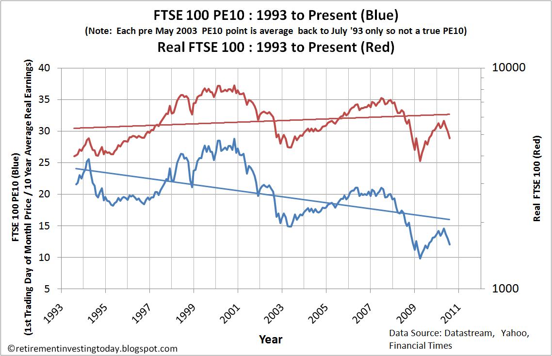
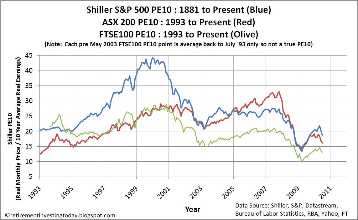
For many months now I have been showing the PE10 for the ASX200 and the S&P500 however what I have always been looking for is a cyclically adjusted PE ratio dataset for the UK FTSE100. In shorthand a FTSE100 CAPE or FTSE100 PE10 depending on your preference for acronyms. Unfortunately a complete dataset has been impossible to find. I have therefore spent many hours constructing one from pieces of data taken from Motley Fool Discussion Boards, the Financial Times marketdata and Yahoo Finance. I therefore can for the first time present a chart of the FTSE100 PE10 and for good measure I’ll throw in the Real (inflation adjusted) FTSE100.

Saturday 10 July 2010

UK Mortgage Rates and Mortgage Approvals – July 2010 Update

Today I present two regular charts that could provide an indication of what is happening in the housing market. The first shows the monthly interest rate of UK resident banks and building societies sterling standard variable rate mortgage to households (not seasonally adjusted) and highlights that for this data set rates remain at near record lows at 3.92% for May 2010 (actual low was 3.82% in April 2009). Compare this with the retail price index (RPI) of 5.1% and the average mortgage is better than free money with a negative real interest rate. Month on month the rate has fallen by 1.8% and year on year the rate has risen by only 2.4%. I’d call both of these changes flat which is obvious by looking at the chart.

Thursday 8 July 2010

The Non Event - Bank of England holds the UK Bank Rate at 0.5% - July 2010 Update


Today’s announcement that the Bank of England had held interest rates at 0.5% for the 16th month in a row plus decided to do no more quantitative easing (QE) was so predictable and such a non event that I nearly didn’t bother posting. I did however discover some interesting data from the Office of National Statistics (ONS), which I’ll cover in a minute, which made a post worthwhile. Firstly let me get the data out of the way.

Wednesday 7 July 2010

My Retirement Investing Today Current Low Charge Portfolio – July 2010

I first started taking my retirement investing asset strategy seriously in 2007 when I became disillusioned with the financial sector and decided to go it alone. While I made a start in 2007 the majority of the time was spent reading about personal finance and it wasn’t until 2008 that I really started to formulate the strategy that you see today. The strategy could be called extreme. I aim to save on average 60% of my after tax earnings and pension salary sacrifices. Following this strategy has me currently forecasting retirement in 6 years. This monthly entry calls me to account and forces me to assess if I am still on track and to determine if all the effort is worth it or whether I would be better off with a simple bond/equity asset allocation that is rebalanced yearly. What I call the Benchmark.

Tuesday 6 July 2010

A History of Severe Real S&P 500 Stock Bear Markets – June 2010 Update

I first started posting today’s charts back in January 2010. I ended that post with “My question is once the governments of the world are forced to stop stimulating the economies through borrowing (for example a bond market strike) or quantitative easing (for example excessive inflation) could we yet see that real -60% bear? History suggests there is still plenty of time for it to occur.” Well that day could be now be upon us. We know that many countries out there are today all but ‘bankrupt’ or in the very least are now talking about and implementing austerity measures. So that writes off stimulation via borrowing at least for the moment. I assume that some countries out there would have another go at borrowing if they really needed to although it would be interesting to see what sort of treatment the bond markets would give them this time around?