Sunday 8 September 2013

Do Retained Earnings find their way to the Shareholders via Share Price Growth

Running this site brings a number of benefits.  To continually provide original content it forces me to continuously research beyond that of the mainstream media, which I find generally contains a lot of vested interests.  It also keeps me accountable to my original Retirement Investing Today philosophy.  If I can’t walk the Save Hard and Invest Wisely for Early Retirement line then how can I expect others to consider following my footsteps, after having done their own research, when I’m not living what I preach.  Yet so often amongst the world of “experts” we see just that.

Let me give a very simple example.  I’m generally a fan of The Motley Fool, particularly the forums, however take some time to read These Savvy Investors Have Just Hit The Jackpot which I thought would be relevant given I added Vodafone to my HYP back in December 2012.  Besides the article being full of errors it was the last sentence that really did it for me – “Maynard does not own any share mentioned in this article.  The Motley Fool has recommended shares in Vodafone and GlaxoSmithKline”.  So somebody is prepared to write an article about how great something is but isn’t prepared to put any of his own skin in the game.  That’s certainly not how this site works.

The negative of my approach is that you the reader generally only ever see one viewpoint, which is my life.  Of course the much valued Comments provide different viewpoints which benefit everyone but I also get an additional benefit, email from readers, which is what today’s post is all about.  A couple of weeks back I received a well thought out email which used some of the regular data that I publish on this site but which was used to answer a different question to that which we usually look at.  Some of the conclusions were also slightly contrarian.  After some email banter that reader has generously allowed me to publish that email.  I hope you enjoy the different viewpoint.   

"
Dear RIT

The big question - Do retained earnings find their way to the shareholders via share price growth?

After a lucky run in business I retired 5 years ago aged 40.  As only a third of my portfolio earnings are paid out as a dividend I have been searching for an answer to this big question.
I came across your FTSE 100 Cyclically Adjusted Price Earnings Ratio (FTSE 100 CAPE) Update post and I'm certain the answer is in there but you need to look at the data slightly differently. Please stay with me as you will love the outcome.

Wednesday 4 September 2013

Use Technology for Early Retirement and Not to Extend Wage Slavery

Looking back over my short 40 and a bit years, technology and access to it really has exploded.  Thinking about technology a little deeper though and I start to wonder whether the majority of people really are using it or whether it’s actually using them.  Let’s look at a few examples.

Credit cards may not be a technology in the strictest sense of the word but technology advancement sure has helped make them an everyday item.  It’s debatable as to who or what was the first credit card, but roll the year to 1951 when 200 pre-approved persons were able to present a Diner’s Club card at 27 New York restaurants and you have something that sounds pretty close to what we have today.  Except even in my “early” years, some 30 years or so post 1951, I remember my parents not even possessing a credit card but instead choosing the debt free alternative, layaway or lay-by.  Fast forward to today and it’s rare to find somebody who doesn't possess a credit card.  Unfortunately this great convenience seems to have been used by the majority to bring forward consumption by piling on debt at the expense of either larger consumption later or earlier retirement.  Instead let me demonstrate how I use my credit card (yes I have a credit card and also save 60% of gross earnings).  I buy everything I need (of course my definition of need is very different to that of many) on credit card knowing that I have the money in the bank.  I get the item now but depending on when in the month I make the purchase I don’t have to stump up the cash, which automatically happens via direct debit, for between 1 and 2 months.  Over that period that money is earning interest for me, adding to my wealth and bringing retirement that little bit closer.

I remember my first computer, which also came in the 1980’s.  It was an IBM XT clone desktop with a processor capable of 4.33MHz and a ‘turbo’ button which pushed that to something like 10MHz.  It had a 20MB hard drive, a CGA monitor and two 5 ¼” (remember those?) floppy disk drives.  It certainly didn’t have a microphone or a camera and in hindsight it did very little to better my life.  Today we have Smartphone’s, Tablet’s and Laptop’s with multiple GHz processors, 100’s of GB (if not TB) hard drives and high definition screens.  Combine that with the internet which was still in its infancy in the late 1980’s and the opportunities to create extra wealth are today nearly endless.  The majority of people just don’t see or don’t want to see the opportunities. Let’s look at a few.

Monday 2 September 2013

Buying Gold Tax Efficiently

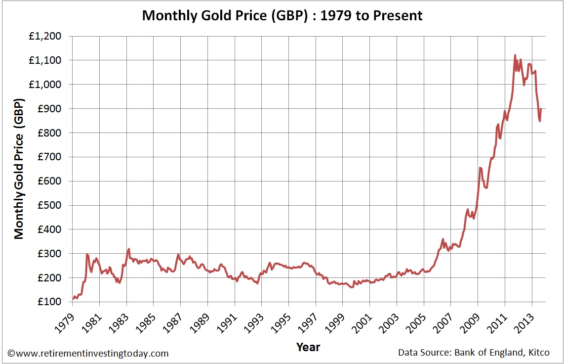
Kitco tells me that Gold when priced in USD’s closed on Friday at a nominal $1,395.50.  Convert that into GBP’s and you’re looking at a Nominal Gold Price of £899.35.  Staying in Sterling that is a Nominal Gold month on month price rise of 6.1% and a year on year price fall of 13.1%.  The chart below shows the Nominal Monthly Gold Price in £’s since 1979.

Monthly Gold Prices in £’s
Click to enlarge

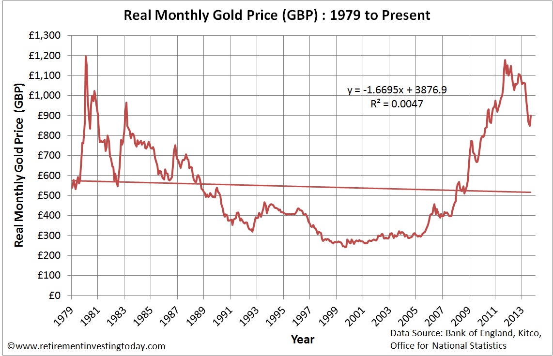
If we then adjust this Gold chart for the continual devaluation of Sterling through inflation we can see Real Gold Prices which are shown in the chart below.  If this is of particular interest then you might also be interested in understanding if Gold can protect UK Investors from inflation.  The key Real Monthly Gold Price metrics are:

  • Real Gold Peak Price was £1,196.28 in January 1980.  At £899.35 we are 24.8% below that peak today.
  • The long run Real average is £544.05 which is therefore still indicating a very large potential overvaluation.
  • The trendline indicates the Real Gold Price should today be £515.36 which would indicate even further overvaluation.  

Real Monthly Gold Prices in £’s
Click to enlarge

Saturday 31 August 2013

Should I put my UK Pension into Income Drawdown or Buy an Annuity

As I sit here, as a late 40 year old, writing this post 41% of my wealth is held within pension wrappers including a very healthy SIPP.  If I stay the course with my Investment Strategy then Early Retirement will likely appear around age 44.  Running a forecast to that age, which looks at my intended contribution profile and expected portfolio diversification into both the pension and non-pension assets, would result in 44% of my wealth being within pensions at that point.  This is of course only going to be true if the my investments perform on average over that period which of course is a big if but is all I have to use for forecasting.

If I then continue with the Transition to Retirement Strategy which includes the purchase of a home for my family and includes rapid pay down of the mortgage in the 11 or so years until I can access my pension assets then my pension wealth will rise quickly as a percentage of total wealth.  This is because my non-pension assets will need to generate my salary as well as pay down the mortgage while the pension continues to grow in value from investment return.  To demonstrate the severity of this if I step my retirement forward 10 years to age 54 my pension wealth could be as high as 83% of my total wealth.  This excludes any equity which I will have in the family home which might frustrate The Investor over at the excellent Monevator somewhat.  That’s a lot of wealth tied up in a wrapper that has a track record of being tinkered with by government.  What’s also interesting is that as I leave the early retirement phase of my life and become a typical retiree my position is probably not that much different to most people who have saved in a pension for a typical retirement.

Step forward 1 year to 55 and it all gets interesting, at least under current pension rules, as I can now start to access my pensions.  The no brainer for me is that I’ll firstly take the 25% tax free lump which in line with the Transition to Retirement Strategy will be used to pay off the mortgage, maximise that years ISA contribution and invest the remainder as tax efficiently as possible.  At that point my forecast suggests around 75% of my total wealth is now within the pension.

Unless I’ve missed a trick I believe I now have essentially two options if I want to generate an income from the remaining pension pot.  I can put the pension into Income Drawdown or alternatively buy an Annuity.  Let’s look at the Pro’s and Con’s of each option plus run an example for each option based on my situation assuming I was 55 today.

Sunday 11 August 2013

The S&P 500 Cyclically Adjusted Price Earnings Ratio (S&P500 CAPE) Update - August 2013

This is the monthly review of the S&P500 including a couple of S&P 500 valuation metrics.  The last review can be found here.

S&P500 Price

At market close on Friday the S&P500 was Priced at 1,691.  That is a rise of 1.4% when compared with 1,669, which is the average closing Price of each trading day last month.  It is 20.5% above last year’s August monthly Price of 1,403.  Note that for this index I only look at monthly average Prices as opposed to hourly or daily as I’m a very long term investor and just don’t need the noise associated with more granularity.  I’ll leave that for the traders out there.

We can then look at how this Price compares to history which is shown in the chart below.

Chart of the Monthly S&P500 Price
Click to enlarge

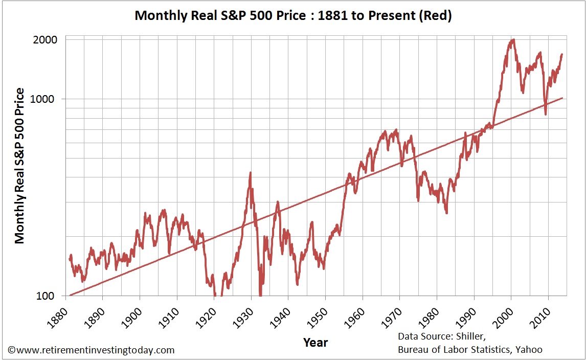
This is a similar chart to that which you will see in many places within the mainstream media when displayed over a long term.  It looks sensational and in my opinion isn’t very helpful.  Let’s therefore adjust it to the chart below where I try to show what is really going on with Prices.  I make two adjustments:

  • Correct the chart for the devaluation of the US Dollar through inflation.  
  • Show the Pricing on a logarithmic scale as opposed to a linear one.  By using this scale percentage changes in price appear the same.  For example let’s say we have two historic prices of 10 and 100.  If they both increase in price by 10% then they increase by 1 and 10 respectively.  On a linear scale it would appear as though the second has increased by a factor of 10 more than the first where on a logarithmic scale they will appear to have changes the same.  Less sensational but more correct. 


Chart of the Monthly Real S&P500 Price
Click to enlarge